LEARN HOW TO COBBLE TOGETHER YOUR OWN STYLE TO BRAND YOUR BOOKS.
Below are two videos about branding the inside of your books, as well as creating an ebook template that contains this styling -- which is part 1.
The second video talks about how to research and cobble together your own custom branding for your book covers. Whether your write stand-alone books or book series, your books will look more professional with consistent branding.
Even if you self-publish, you will be working towards your own recognition as a professional and serious author. I hope you enjoy the videos. If you have any questions or other tips, be sure to post them under the videos. I do read the comments.
Whether your book or books are stand-alone books or a series, it is important to take a little time and decide on how you want to brand your books. After a while, your readers will get used to your brand where they will be able to spot a new book with just one glance.
Branding your books also makes the books appear more professional. This process that I will cover in this blog post is easier than you think. It takes about an hour or so of research.
There is a video below where I go into a bit more detail about how to surf around Amazon.com and pick and choose elements to add to your own signature brand.
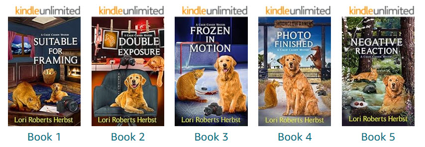
Below is one example of how Author Lori Roberts Herbst brands her books with the same dog and cat, similar colors, on the front of the book.
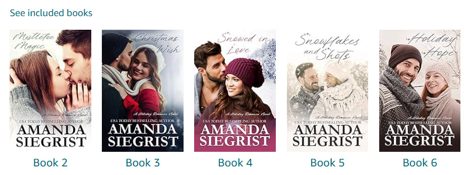
Below is an example of how the fonts alone and a "sweet couple" on the cover can create a signature look. This would be an easy one for anyone who is self-publishing and on a tight budget.
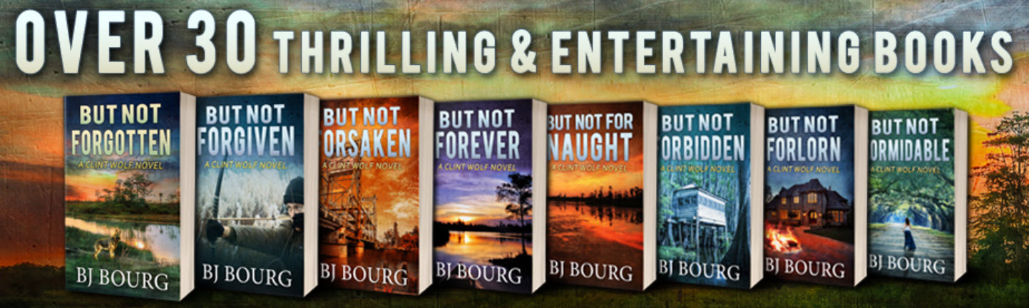
And here is one last example for the blog post. Author BJ Bourg uses not only the same author and title font, but also each book begins with "But not . . ." Great example of marrying a series together.
ADDITIONAL BRANDING IDEAS:
Shared background picture
Shared background color
Shared tonal color
Fonts & Title Placing on Covers
Motifs and/or graphic designs
Glow behind cover figures
In the video below, I go over several examples showing you the different ways that authors brand their books. You can pick and choose which elements you like and come up with your own unique look.
Go to Amazon.com, look up your genre, and then begin searching around. In no time, you will come up with a way to create a signature look you really love.
IF YOU SELF PUBLISH YOU CAN REDESINE A COVER AT ANY TIME
If you have published a book or two -- or maybe three, and you're just learning about branding, you may choose to do a cover redesign. Just be sure you have a little extra time on your hands because you will need to change up the books on all the websites including Amazon, Bookfunnel, etc.
You may also need to redo or create anew marketing pictures. But a cover redesign is a good way to create a new buzz about a book that's losing attention. A new cover can suddenly get you some 'new kid on the block attention'.
NOW LET'S TALK ABOUT BRANDING THE INSIDE OF THE BOOK:
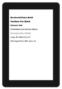
CHOSING FONTS:
Different fonts connote different moods. Look up romantic comedy books and notice that the fonts used are very whimsical or comical in some way. They go with the theme of the book. Vampire books have several fonts that are used over and over again as they have a very 'wicked or scary' look to them.
One hour of research online and you will find the best choice for a cover font. Remember, you want to fit into your category and genre but make the font your own.
STYLIZING YOUR EBOOK MANUSCRIPT:
eBooks all need to be formatted for what Amazon is calling "easy flow". The reason for this is because eBooks are read on eReaders, Amazon eReaders, Tablets and even online. The Kindle app allows readers to change the fonts, choose a theme, change the size of the font, and even change the background of the page color.
So when you upload a book onto KDP, especially as a Word document, it is uploading one paragraph and one headline at a time. Then when it delivers the books, it is like pouring the book onto an eReader like a glass of iced tea. Most of the font choices will be ignored in this upload. EVEN IF YOU EMBED THE FONTS!
DROP CAPS VS. FOUR WORDS CAPITALIZED:
Because of the easy flow, I've tested the drop caps several times using my phone and tablet and it didn't get it right from every size. So I would caution anyone, especially newbies, from attempting to use even Drop Caps on the first paragraph. If you have having the book professionally formatted, that's fine. But if you are doing it yourself, an easier way to give the first paragraph a bit of personality is to capitalize the first three or four words. It gives the same stylish flair to the first paragraph without the worry of what the easy flow will do to it.
UPLOAD AS AN EPUB FOR MORE CONTROL IN EBOOKS:
However, if you really want to have control over the chapter title font and use a fancy normal font, number one, you need to have the license for it. If you choose a Microsoft font, you won't need any licensing. But any other font that you get off the internet, you will need a license. A good place to look where they have fonts you can use anywhere is dafont.com.
Secondly, you will need to convert the word document into an ePub so that the different fonts are added to the style sheet. There is a program called Sigil that helps with this conversion. If this sounds like Greek to you, it's because it has to do with computer coding. I also have a video on my channel about using Sigil to create chapter headers.
I uploaded the sample above using Word and all the different fonts. None of them worked even though I had embedded the fonts in the options section. The Ebook converted them all into a default font. However, when I converted the same manuscript sample into an ePub then the book did show the different fonts.
FORMATTING PAPERBACKS & HARDCOVERS:
Now, you will upload pdf files for the paperback and hardcover manuscripts, so you can use whatever font you want. You will need to embed the fonts in the document (which is done from the options section) but however your book looks in the pdf, it should be okay.
The only part that gives anyone trouble is in the odd page vs. even pages. If you don't get that right, even the PDF will throw in empty pages. So be sure to see my formatting video on that.
A FEW LAST TIPS ON BRANDING:
First line - Initial caps vs. drop caps (See above)
Indents & line spacings - be consistent - give the reader some breathing room.
Chapter headings and subheadings - If you want anything fancy, you will need to convert to an ePub.
Scene endings - Be consistent, always use the same markings.
~ Meanwhile ~ Chapter indicators - Be consistent
Chapter title spacings - Be consistent
Offer 10% of next book in the current book.
Include a link to join your newsletter
Include a link to leave a review
CONCLUSION:
It's really that easy to brand your books. It just requires a little bit of forethought and an hour or two of research. Below is a video where I cover the research a little more in depth.

 Shared background picture
 So when you upload a book onto KDP, especially as a Word document, it is uploading one paragraph and one headline at a time. Then when it delivers the books, it is like pouring the book onto an eReader like a glass of iced tea. Most of the font choices will be ignored in this upload. EVEN IF YOU EMBED THE FONTS!
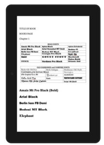
 Now, you will upload pdf files for the paperback and hardcover manuscripts, so you can use whatever font you want. You will need to embed the fonts in the document (which is done from the options section) but however your book looks in the pdf, it should be okay.