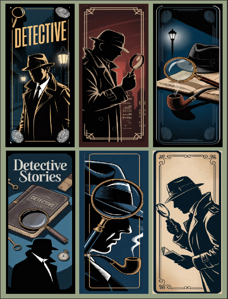
Click above to download a high resolution graphic file from Google Drive.
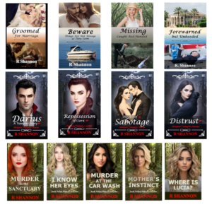
Great Bookmarks for your favorite mystery readers.
They can double as gift tags too!
Author Marketing Website

Click above to download a high resolution graphic file from Google Drive.
Great Bookmarks for your favorite mystery readers.
They can double as gift tags too!
Click above to download a high resolution image file from Google Drive
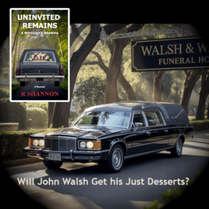
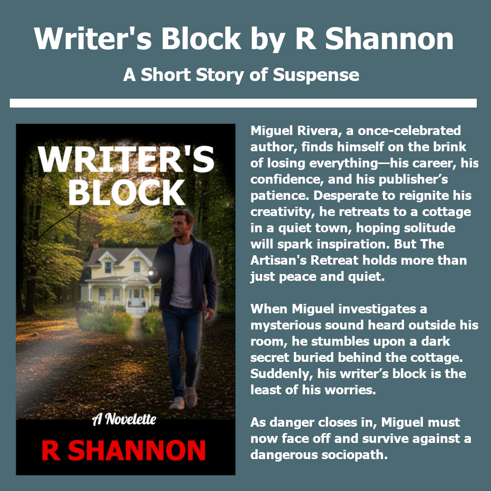
John Walsh is a successful funeral director with a loving family but he has a weakness for other women. The modern world thinks cheating is a victimless crime, but is it?


<pstyle="text-align: center;">Christian/Catholic Friendly Private Investigations Series
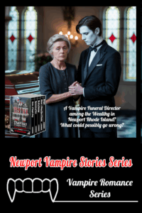
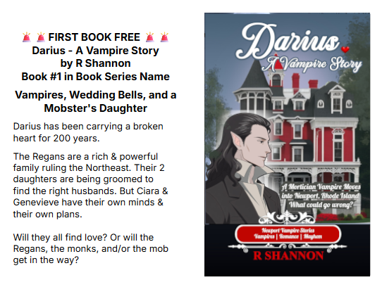
A Vampire Saga with Mayhem & Satire
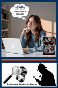
Ready to Learn How to Write Your Own Mystery Novels?
John Walsh is a successful funeral director with a loving family but he has a weakness for other women. The modern world thinks cheating is a victimless crime, but is it?
John Walsh is a successful funeral director with a loving family but he has a weakness for other women. The modern world thinks cheating is a victimless crime, but is it?
John Walsh is a successful funeral director with a loving family but he has a weakness for other women. The modern world thinks cheating is a victimless crime, but is it?
John Walsh is a successful funeral director with a loving family but he has a weakness for other women. The modern world thinks cheating is a victimless crime, but is it?
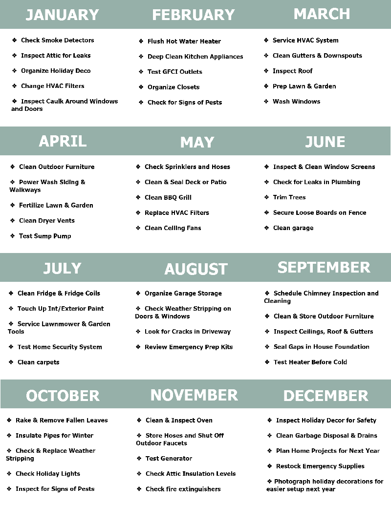
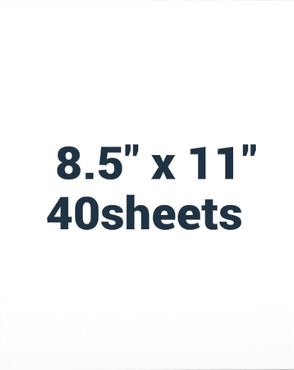
Click on the list above and you can download the list and print out on an 8" x 11" paper or cardstock.
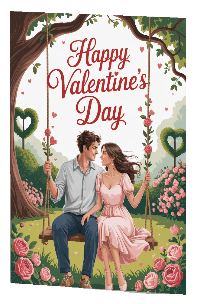
Need a last minute decoration for the holidays? Or maybe you forgot to get a Door Poster for this coming holiday -- which is tomorrow?
Here's one you can print out on 8.5 x 11" cardstock, get some double-sided tape, and you're good to go!
These posters are strong enough to last from year to year. Who has the space for blow-up or bulky decorations anymore? This one can easily slip against a closet wall and be used from year to year.
Put one on the front door and the back door!

John Walsh is a successful funeral director with a loving family but he has a weakness for other women. The modern world thinks cheating is a victimless crime, but is it?

Click above to download a high resolution pocket emblem from Google Drive. Image can be shrunk or stretched a little bit.

<pstyle="text-align: center;">Christian/Catholic Friendly Private Investigations Series
A Vampire Saga with Mayhem & Satire
Ready to Learn How to Write Your Own Mystery Novels?
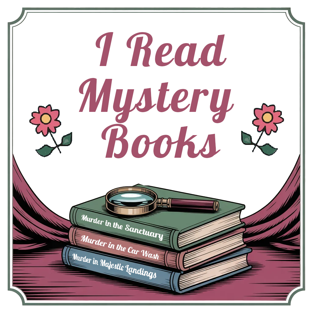
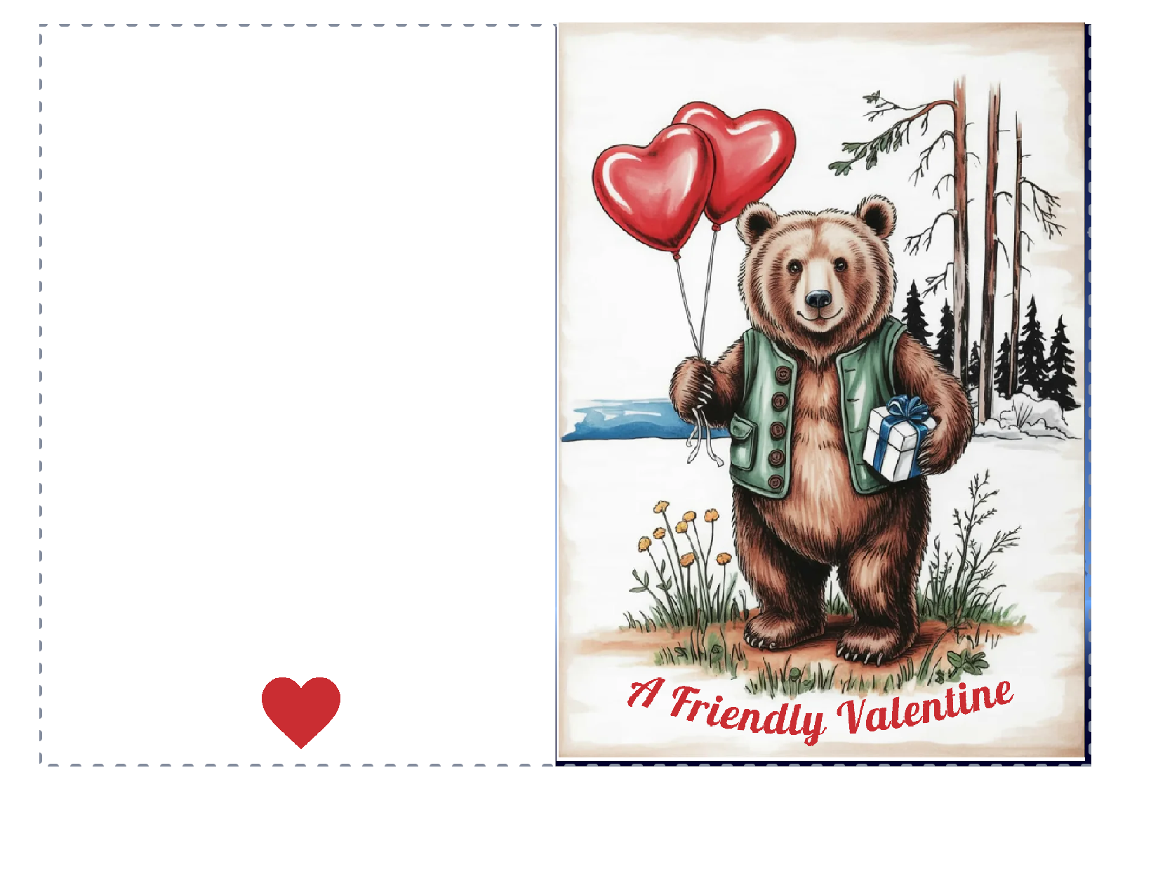
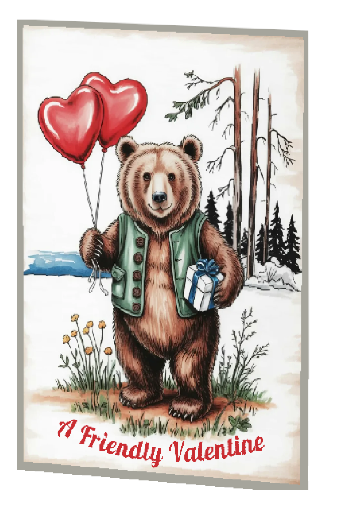
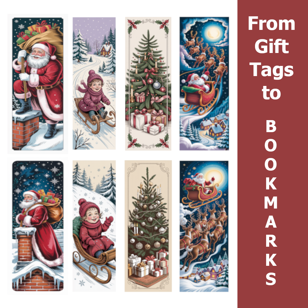 Click here or above and you can download a large format png of the Christmas themed gift tags to bookmarks. Passing a simple bookmark is a way to let someone special know you are thinking of them. Or se them as giveaways at craft shows. Insert them into your giveaway books. Let one hang from the bow on a birthday gift. They are the perfect Tiny Gift for the holidays