Rebrand of a Vampire Book Series – Part 1 – Why Rebrand?
PART 1 - WHY? WHY DO A REBRAND?
STRATEGY 1: The Facelift
I have lived through two or three book facelifts and/or rebrands and this blog and video series will be about why and how I did it. There was a lot of research done behind each one, so I want to share my experience and know-how with new writers.
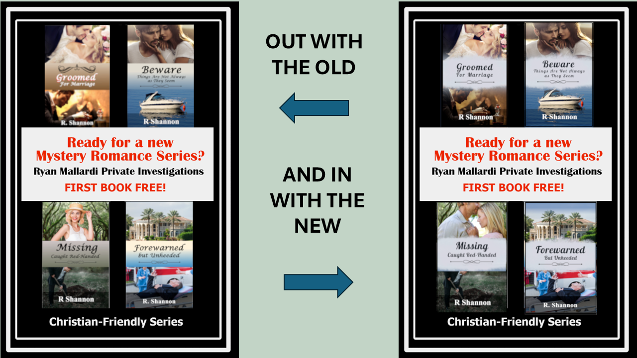
I have posted a comparison picture above where you can see how my first book series started out and how, after improving my graphic skills, I rebranded my books to look more like a book series.
There is even an earlier version of my covers that I go into in the video below, but this shows where I came from and when I ended up when I set out to rebrand for the purpose of making the books look more like a unified Book Series.
Another reason for a new book cover, or a facelift as many people call them, is to just freshen up the book. Has it been on the market for a few years and the response has died down a bit? You can breath new life into the book with a new cover or set of covers for a series.
MY SECOND REBRAND WAS FOR MARKETING PURPOSES.
It has taken me a long time since first publishing this second book series to find the right genre and categories to position my Newport Vampire Stories series. I wrote and even finished this series long before I knew about book branding or the importance of finding the right 'sub categories' to position the books in.
In the world I grew up in, a book store had about 20 to 25 specific sections. All the vampire books would have been kept in the sci-fi or fantasy area of the book store. And that's how I branded my series right out of the box, as vampire books.
Following more experienced author's advice at the time, I went to the Vampire Romance Best Seller List on Amazon and looked at all the covers. The advice was to look at the book covers in the same genre and strive to have your book covers fit inside this category. Because this BSL on Amazon is proof of which books sell the best. So that's what I did.
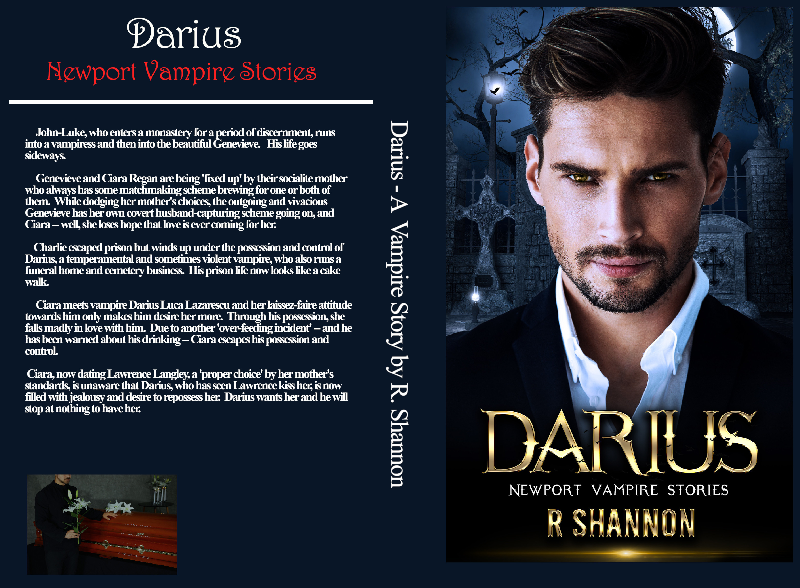
This is the first cover I paid for at Fiverr.com. I paid $50 for a high resolution eBook cover and I blended the colors to create the paperback and Hardcovers with only that investment. I loved this cover and it did match many of the books in the top vampire book category.
Again, in a short while, based on some bad feedback from readers, I realized the readers had a completely different expectation of what the series was going to be about. The cover is dark and maybe the readers were expecting more of a dark horror or gothic horror. My book is more of a satire and it's written with a bit of tongue in cheek. So that was a newbie mistake I made and my reviews are still paying the price.
I decided to lighten up so I went back to Fiverr to find my designer and now he wanted $200 for each cover! His prices had gone up and that was too much money. I go into detail in the video of this subject about how much trouble the 'title font' caused me but I won't go into it here. Just know that I looked high and low and could not find a similar font and I wound up changing the bottom 'section' only of the covers.
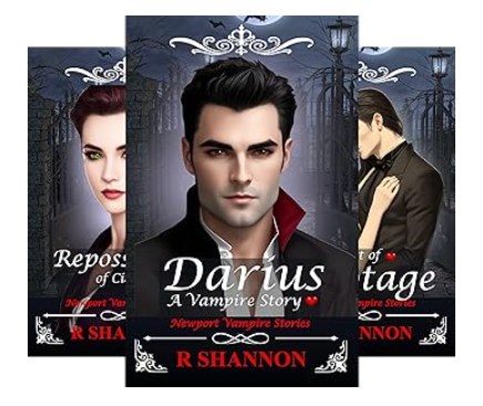
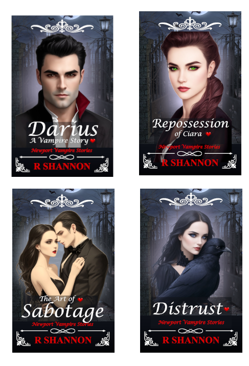
This revamp of the covers occurred at the same time as AI was released on the public. I went to Leonardo.ai and was able to create consistent 'vampire characters for the book covers. Below is a picture I saved from this reinvention. These covers I made on my own.
As you can see, I was more aware of book branding and series branding and the books look like a series. I had also upgraded my graphic skill set to learn how to put a glow light behind characters, so I was very happy with the covers.
As a side note I will say that I have never been able to get the same level of consistency from AI since this time. Now when I work with AI graphics, I have to piece together tiny parts of the AI creations in order to create what I want, as you'll see as I reveal the final rebranding.
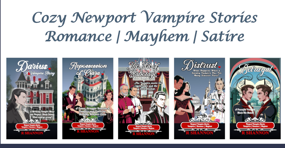
I felt that these covers softened the look of the series and I believe they did. However, in a conversation with another author about 'cozy mysteries', I realized that the humor and satire in my books was closer to a 'cozy mystery' and this could be why people who bought the book were looking for the despair of Anne Rice or the teen vampire saga from Twilight, or even more of a gothic story. That's when I decided to rebrand to completely reposition the books into a 'cozy vampire' and a 'cozy vampire mayhem' rebrand.
The book series expanded into five books and above is the final series rebrand. Every cover had to be redone but I believe that this cover presents the stories as more fun, cozier, less of horror stories, and this brand is much more fitting for the actual series.
A lot of research, study and learning has taken place since I began creating my own covers. I wish I knew then what I know now, but that's not the way experience works. However, I am hoping that by sharing what I have learned 'the hard way,' that I can save newbies a lot of blood, sweat and tears.
Looking from picture to picture above, one can get the idea that this was an easy fix or a fast change, but it was a huge project, and in the next sections of the series, I will go into how I organized for the project, what I wanted to accomplish, and how I went about it.
Below is the video I made to go along with this section of the series.
Here is the first video that goes with this Blog/Video Series: