Which font should you use when self-publishing? The more choices we have, the harder it gets to choose.
I always chose Times New Roman as that was the font default in journalism, for books and newspapers for my entire life. However, since Microsoft added hundreds of fonts, I now see any number of fonts show up.
Below are the most common fonts in my opinion:
As you can see from the picture above, even fonts of the same size are heavier and lighter than each other and even the numbers are larger and smaller. My favorites are Times New Roman and Trebuchet MS.
BOOK COVER FONTS – Pretty Fonts:
When it comes to Book Cover fonts, that’s another story. You want something that is attention capturing. I have gone through all of the fonts in Microsoft Word and below I have created a large list of the ones that would be appropriate for book covers.
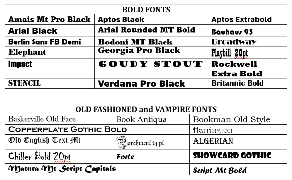
Often you may want to also have fonts that are heavy and bold. I again went through all the fonts and made a table with those fonts too. I also added some old fashioned and vampire-like fonts.
I remember being new and overwhelmed while planning my first book cover. There were too many choices and I was trying to find the best fonts to “fit in” with other authors. In the beginning, this was very important to me.
I hope this helps.
You can print out this page or you can screen shot and save on your computer. But if you want to download copies of these lists in one download, click below: