CREATING YOUR FIRST BOOK SERIES BUNDLE:
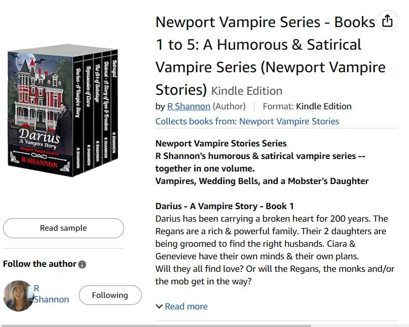
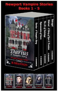 How exciting! I just recently put together my first book bundle for my Newport Vampire Series and decided to put together a how-to blog and video for anyone else who wants to learn how to do it. I've organized the process and I've posted it below and will have a video to accompany it. I hope it saves you several hours of research!
It turned out to be easy enough, but when I first set out to figure out how to do it, it was nerve wracking! I think I figured out an easy way to do it for next time, and I off that to you now with this blog post. Below I have organized how to put it together easily without the worry of ruining your original manuscripts.
HOW TO SET UP EACH OF THE BOOKS:
 You will be stripping out front matters and back matters from all the middle books, but leaving the front matters, with a few changes, on the first book, and keeping the back matters on the last book. I'll go into a little more detail below.
The biggest tip I can give you is to make a "bundle-copy" of each of your final eBook manuscripts so that when you alter them, you are not ruining your original manuscript. This is a little bit of a tedious process and the more organized you are from the beginning, the smoother it will go.
THE FIRST BOOK:
- Using the new bundle copy you have saved, go into the eBook and change
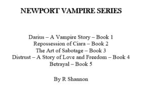 the title of the book to the title of your series. For example: My book was called Darius - A Vampire Story so I changed it to Newport Vampire Stories Series, and listed all five books followed by my author name. I was happy with the way it looked in the final manuscript. If your books have subtitles, I would just put them under the title of the books.
 - If you want to have a Title, Subtitle, and then add language about the bundle, you will make this change on the two title pages.
- Leave the copyright page and change any language about the book to the book series.
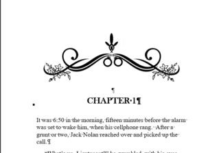
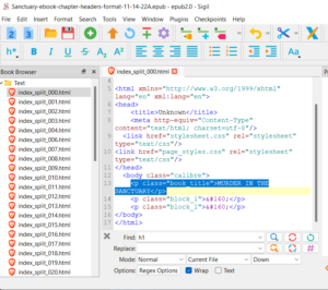
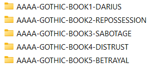
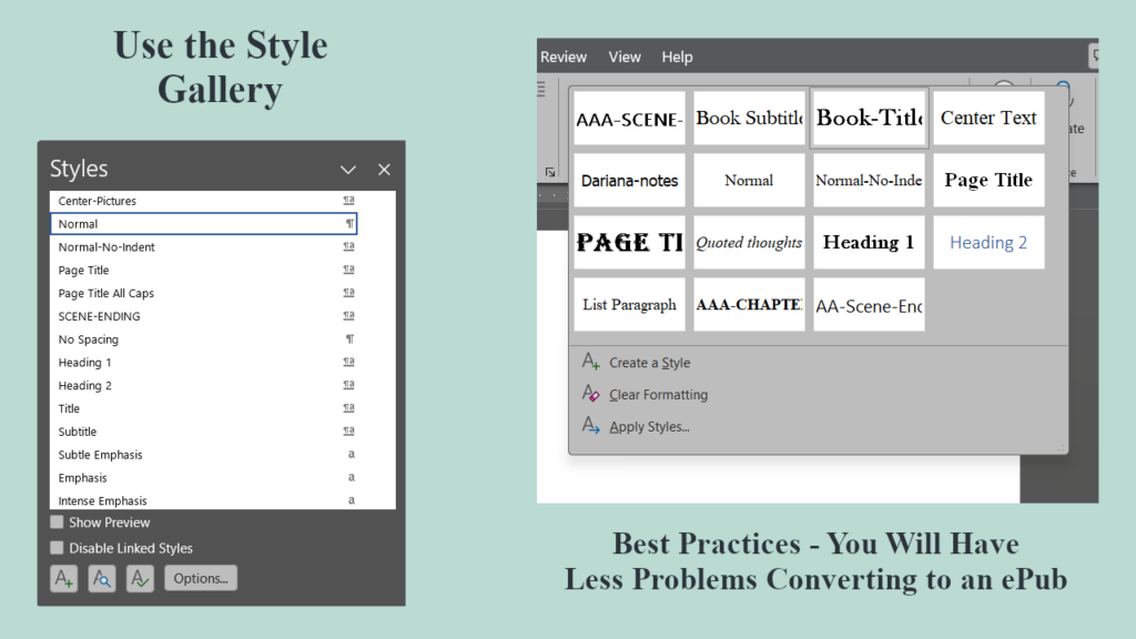
- On the line above Chapter one, add in the Name of the book and give it a style -- from the style gallery -- of H1. (See graphic below)
- Then change all of the Chapter names to H2s.
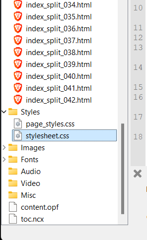
- Strip out all of the back pages. The last page should be the last page of your first ebook.
THE MIDDLE BOOKS:
- Strip out all front matters and back matters.
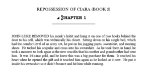
- Add the name of the book above Chapter 1. Give the book name an H1 Style. See graphic below.
- Go through the document and change all chapter headers from H1 to H2.
- These books should begin with the Title of the book, Chapter 1 through the last chapter and end after the last word in the last chapter.

THE LAST BOOK:
- Strip out all front matters but leave the back matter, the acknowledgement page, the thank you for reading my book page, the other books by page.
- Add the Name of this last book right above Chapter 1 and give it the H1 style.
- Then change all of the chapter headers from H1 to H2.
ASSEMBLING THE BOOK:
- Open up Bundle Book 1 document. This will be the ultimate final manuscript, so save this now with the series name. For example: NVS-Bundle-Manuscript.
- Add a page break after the last word in the last chapter.
- Open the second book document and copy everything. Paste as the next book in the Bundle-Manuscript document.
- Copy and past the next books in line, ending with the last book that has all of the final pages still in it.
- Go back to the top of the document and check for any and all extra spaces or other errors.
- Save as the Bundle Document.
RUN THE TABLE OF CONTENTS:
Run the table of contents and check it. Check and make sure all of the chapters are accounted for. If any of them are missing, it means you didn't add the H2 to the Chapter name.
If you find that not all of the chapters are underneath the Book Name, this means you didn't change a chapter name from H1 to H2.
SAVE AND PREVIEW IN KDP PREVIEW WINDOW:
Once it is finished, be sure to check the book page by page in the KDP Preview window.
VIDEO OF PROCESS BELOW:
I will post the video of this process below so you can see the Table of Contents being created. I have other videos on creating the Table of Contents, but I find it less nerve wracking when I can see the process done in real life.
I'm planning to do a video on how to create a 3-D version of the series for Amazon, so be sure to check out my blog and/or my YouTube Channel.
The video will be posted below when it is available!


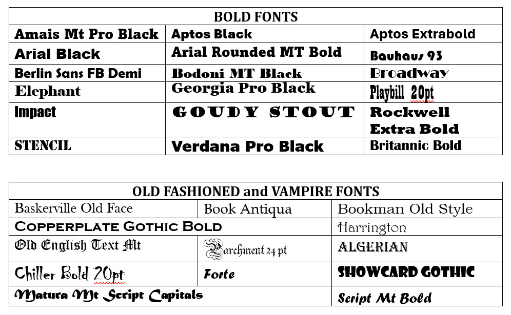
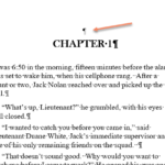
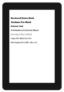
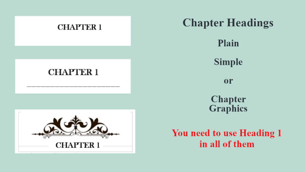 Chapter title graphics can be very tricky with the 'easy flow' settings and all the different eReaders that use the Kindle App. I've started using a simple Chapter underline and seem to have no problems with it.

 If you, however, are self-publishing and are planning to do your own marketing, giving away your book, especially when you are just breaking in as an author is crucial. Once you decide to give away your books, you will need a PDF document and an ePub document.
 Shared background picture
 So when you upload a book onto KDP, especially as a Word document, it is uploading one paragraph and one headline at a time. Then when it delivers the books, it is like pouring the book onto an eReader like a glass of iced tea. Most of the font choices will be ignored in this upload. EVEN IF YOU EMBED THE FONTS!
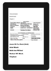
 Now, you will upload pdf files for the paperback and hardcover manuscripts, so you can use whatever font you want. You will need to embed the fonts in the document (which is done from the options section) but however your book looks in the pdf, it should be okay.
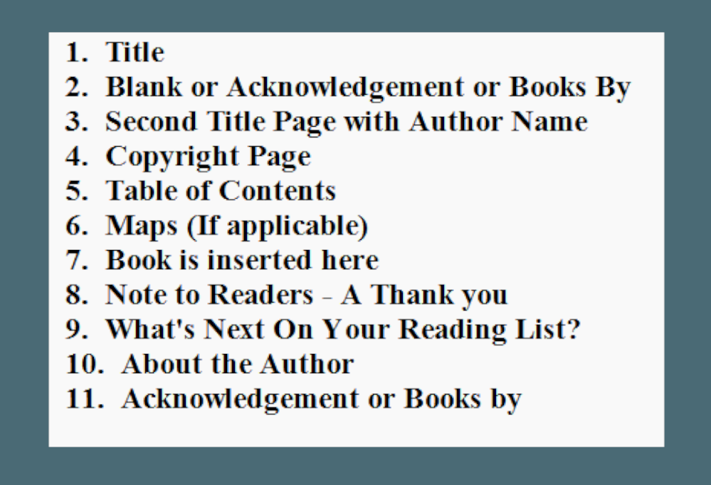 This book is for beginners who are publishing their first or second novel and they are still a little skittish about what else goes into a book. I’ll lay it out so you can easily follow the list and be confident that you’re not forgetting anything. These page suggestions are taken from the publishing industry. These are the pages that appear in a book published by a publishing house.