 This book is for beginners who are publishing their first or second novel and they are still a little skittish about what else goes into a book. I’ll lay it out so you can easily follow the list and be confident that you’re not forgetting anything. These page suggestions are taken from the publishing industry. These are the pages that appear in a book published by a publishing house.
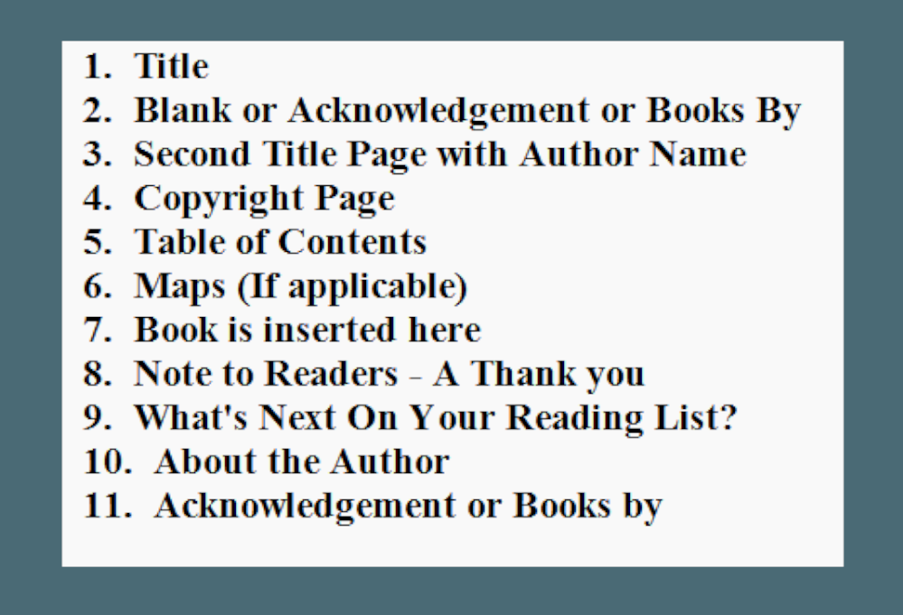
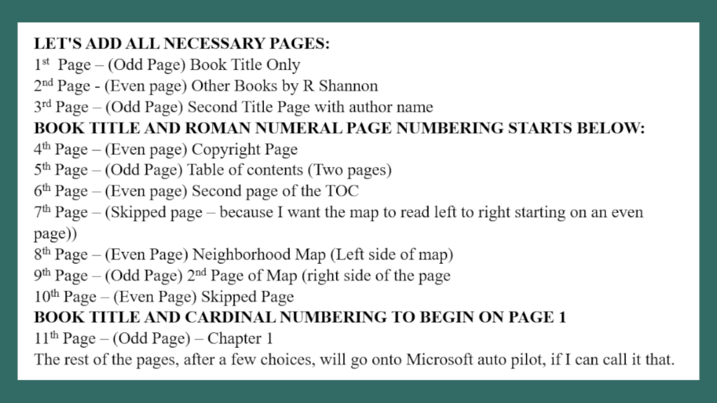
Often the pages before a book starts are referred to as “front matter”. Pages 1 to 6 would be considered Front Matter. The rest of the pages after the book is inserted are considered Back Matters.
PAGE 1: A Title page with only the name of the Book. The font is usually big enough for the title to stand alone. It is usually centered on the page horizontally and vertically.
Page 2: Either a blank page or a Books by Page. If you have other books that are published, you can list them on this page. The title should be something like “Other Books by AUTHOR NAME”.
Page 3: A second Title Page, but this one will have the name of the book, and below it the name of the author. Again, this is in larger font and it is centered vertically and horizontally on the page.
Page 4: Copyright page. I am not a lawyer so I can’t give you any information that is legally correct. However, I can tell you that I cobbled together different verbiage that I found in other author books. I made it long enough to cover my bases, but not too long. Below is the verbiage that I used.
COPYRIGHT:
This book is a work of fiction. Names, characters, places, and incidents are the product of the author’s imagination or are used fictitiously. Any resemblance to actual events, locales, or persons, living or dead, is coincidental.
Copyright © 2024 by AUTHOR NAME
Forward copyright © 2024 by AUTHOR NAME
Preview of this book copyright © 2024 by AUTHOR NAME
All rights reserved. In accordance with the U.S. Copyright Act of 1976, the scanning, uploading, and electronic sharing of any part of this book without the permission of the publisher constitute unlawful piracy and theft of the author’s intellectual property. If you would like to use the material from the book (other than for review purposes), prior written permission must be obtained by contacting the publisher at AUTHOR’S EMAIL.
Thank you for your support of the author’s rights.
Then you can put the name of your publishing company, if you have one, otherwise, leave the rest of the page blank.
Page 5: Table of Contents. eBooks require links for chapter beginnings and Paperback and Hardcover require page numbers.
Page 6: (If applicable) Any maps that you may be including in your book.
Page 7: Next comes your book.
Page 8: Note to Readers.
Dear Reader:
Thanks for giving your time to read this story. I hope you enjoyed it.
As a new fiction author, reviews are very helpful to me. If you enjoyed this novel, I’d be so grateful if you would leave a review on Amazon.com. Here is a direct link: (Add link to the review for this book).
[In order to create a review link, you will need the ASIN number of your book. Then swap out your ASIN Number or ISBN number for the X’s in the link below:
https://www.amazon.com/review/create-review?&asin=XXXXXXXX]
I love to hear any feedback about the book and enjoy interacting with my readers, so please feel free to email me at AUTHOR EMAIL
Thanks again!
AUTHOR NAME OR SIGNATURE
Page 9: What’s Next on your Reading List?
Verbiage: Below is a chapter or two of my next book (or the next book in a series) for you to sample. I hope you enjoy it.
Then insert up to 9% of the next book. I keep it under 10% in case you are in Kindle Select. They allow up to 10%, but I like to keep it on the lower side.
Page 10: About the Author: Add a biography of yourself. Be sure to add a contact email as well as a little personal information.
Page 11: Acknowledgements: This page can go here or in the beginning of the book. You can put it in lieu of “Other Books By Page.” If you do use the Acknowledgements in the beginning of the book, then you can add the Other Books By Page here at Page 11.

 As authors, we all know how hard it is to get readers to take a few minutes of their time to leave reviews. I believe one part of the problem is that the Kindle app doesn't make leaving a review from the app from a tablet or phone easy.
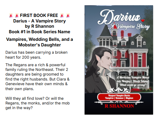

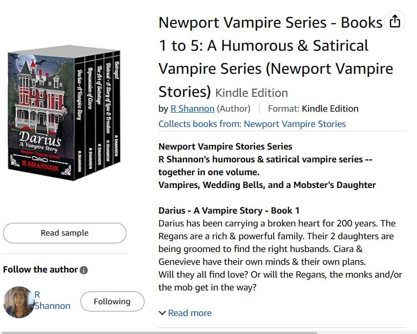
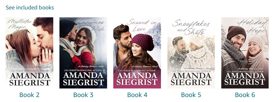
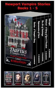 How exciting! I just recently put together my first book bundle for my Newport Vampire Series and decided to put together a how-to blog and video for anyone else who wants to learn how to do it. I've organized the process and I've posted it below and will have a video to accompany it. I hope it saves you several hours of research!
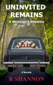
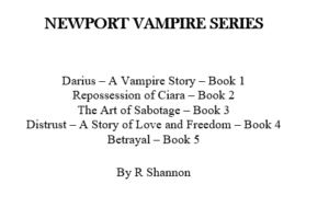 the title of the book to the title of your series. For example: My book was called Darius - A Vampire Story so I changed it to Newport Vampire Stories Series, and listed all five books followed by my author name. I was happy with the way it looked in the final manuscript. If your books have subtitles, I would just put them under the title of the books.


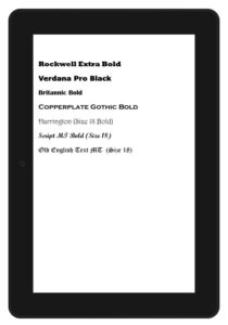
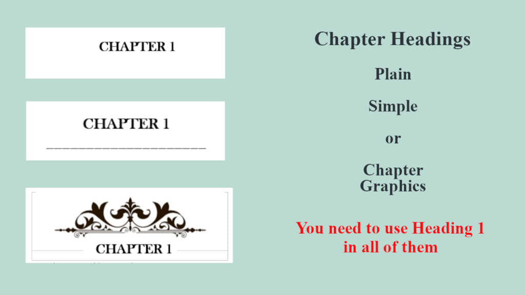 Chapter title graphics can be very tricky with the 'easy flow' settings and all the different eReaders that use the Kindle App. I've started using a simple Chapter underline and seem to have no problems with it.

 If you, however, are self-publishing and are planning to do your own marketing, giving away your book, especially when you are just breaking in as an author is crucial. Once you decide to give away your books, you will need a PDF document and an ePub document.
 Shared background picture
 So when you upload a book onto KDP, especially as a Word document, it is uploading one paragraph and one headline at a time. Then when it delivers the books, it is like pouring the book onto an eReader like a glass of iced tea. Most of the font choices will be ignored in this upload. EVEN IF YOU EMBED THE FONTS!
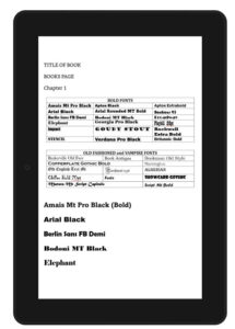
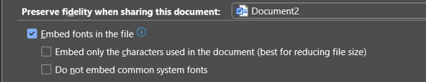
 Now, you will upload pdf files for the paperback and hardcover manuscripts, so you can use whatever font you want. You will need to embed the fonts in the document (which is done from the options section) but however your book looks in the pdf, it should be okay.
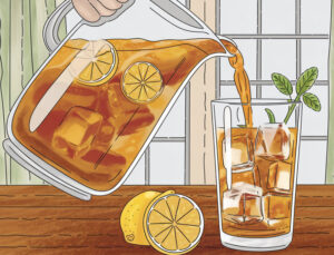 What makes it possible to use a 6" x 9" ebook template for the eBook is the easy flow settings that are needed so that eBooks can fit on any size eReader, tablet, or phone.