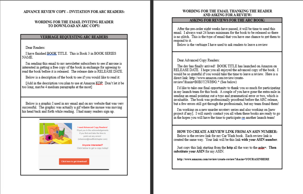
Are you ready to offer a free Advanced Reader Copy? Why reinvent the wheel. Click below to download my Instructional and Cheat Sheet
The form you have selected does not exist.
Author Marketing Website
Are you ready to offer a free Advanced Reader Copy? Why reinvent the wheel. Click below to download my Instructional and Cheat Sheet
The form you have selected does not exist.
This blog post is geared specifically for book marketers in the examples I use, but the information is relevant to anyone who is interested in learning how to use Mailchimp as a marketing tool.
Before we go to Mailchimp, it's important to know where Mailchimp fits into the whole picture. So let's take a closer look at how Mailchimp comes into play when you are selling and/or giving books away.
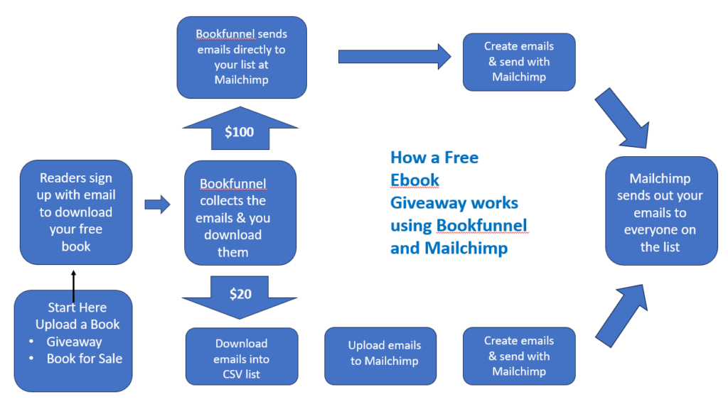
Above is a diagram of how once you upload a book at Bookfunnel, and a reader clicks on it, the diagram shows how the $20 a year package handles the email and how the $100 a year program handles it.
As you can see, there is one manual step of downloading the emails from Bookfunnel and then uploading them into your email list at Mailchimp. If you are a brand new author or a brand new marketer, if you know how to copy and paste, you can move emails from Bookfunnel to Mailchimp.
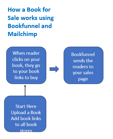
I added this diagram to show new book marketers that entering sales promotion is not the same as giving books away. When readers click on your giveaway books, that's when they sign up for your newsletter.
If you enter your book into a sales promotion, the readers go directly to your book to purchase it. I mention this because, as a newbie, I went through a long period where I entered too many sales promotions and not enough giveaways!
As anyone in marketing will tell you, people unsubscribe from time to time. So it's important to continually build your email list. With this knowledge, hopefully you won't make the same mistake I did.
There is a 30 day free trial at Mailchimp. You have limited access to some of the bells and whistles, but there is 30 days where it will cost you nothing. However, as soon as you click on this button, you will be taken to the page that compares all of their pricing packages.
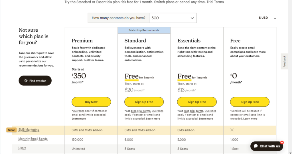
The process of growing a sizeable book marketing email list takes a lot longer than 30 days, so it's best that you know what is behind the other packages that we will focus on.
The free plan only allows you to collect up to 500 emails. That's a lot for a beginner, but you will be surprised how quickly you can accumulate over 500 emails. The next package is called the Essentials package. This one costs $13.00 a month or slightly over $100 a year. This is the plan I have been using.
This plan allows you to build a list up to 2500 emails. Once you grow over that amount, it begins to charge a little more for every 5o to 100 emails after that. Once you grow past 3,000, then this becomes an expense. Hopefully by then you will be selling enough books to cover your monthly business costs.
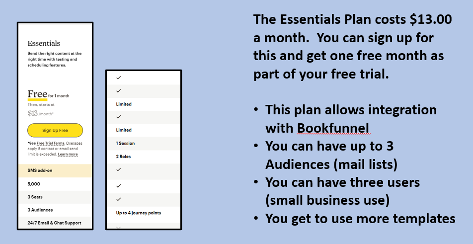
Here is a close-up of the Essentials plan. This plan works well for me as a book marketing platform for the following reasons:

I already touched on how to use Tags to segment off your one audience list. Above I have a snapshot from the video and it shows an example of some of the tags I have used with my giveaways both at Bookfunnel, SiteOrigin and my website at readfirstchapter.com.
We’re going to cover how to sign up, what the dashboard looks like, how to upload your books, where to find the promotions to enter, what an author swap is and how to find one. I’ll show you a few examples using my own books.
 Go to bookfunnel.com and sign up for an account. Here is a screen shot from the first page. I've fiddled with it to show the actual address and the logo, but it will look similar to this picture here.
It's important to read the rest of the blog first so you know which plan or package you want to sign up for.
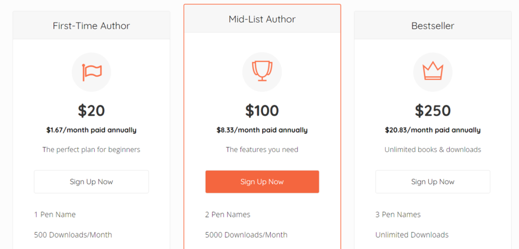
The first package called First-Time Author costs $2o per year. This is good enough for a new author or anyone else operating on a shoe string. With the $20 package, you are entitled to one pen name, and up to 500 downloads per month.
With this $20 package, you can't coordinate your email list with a mail program. However, that's not a problem because all of the emails are saved for you and you can download them from the dashboard. Then you can easily upload to Mailchimp using a simple copy and paste.
The next package is $100 a year. That comes out to $8.33 a month. With this plan, you can have up to 3 pen names and up to 5,000 downloads. But the most important benefit to this plan is that you can integrate Bookfunnel with Mailchimp or several of the other popular mail programs out there. This gives you the ability to put this entire thing on autopilot. This is the plan that I use. This also gives you the right or ability to sponsor your own promotions.
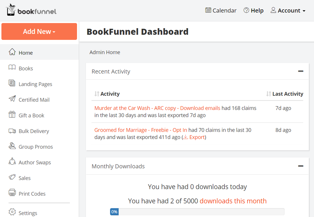
Above is a snapshot from the Bookfunnel dash board. This keeps a daily count of how many downloads and clicks you have gotten from your giveaways and books that were entered into the various promotions.
There are links on this page in order to download the emails. So if you choose to get the least expensive plan, this is where you will go to download your emails. Bookfunnel prepares them into a CSV file and you can save and/or open these in Excel or Google Docs.
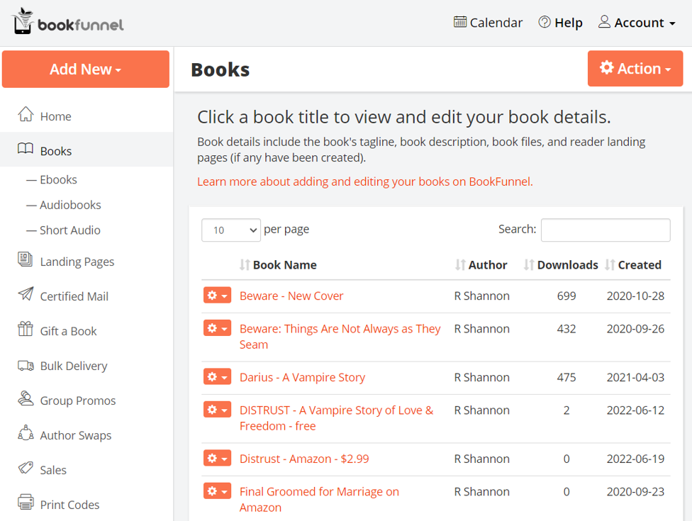 The Books Tab keeps track of the eBooks you have uploaded and how many downloads there have been. There are drop-down links (in the orange boxes) to edit your books information and also to reupload copies.
I have perma-free books as well as Amazon Kindle Unlimited books. I usually have an advanced reader copy being given away also. So I use the Giveaway pages as well as the Sales pages. I always insist that the readers give their emails to get the books.
Some authors are very touchy about giving away eBooks, but I believe giving away the books is the best, easiest and most cost-effective way of building a readership there is.
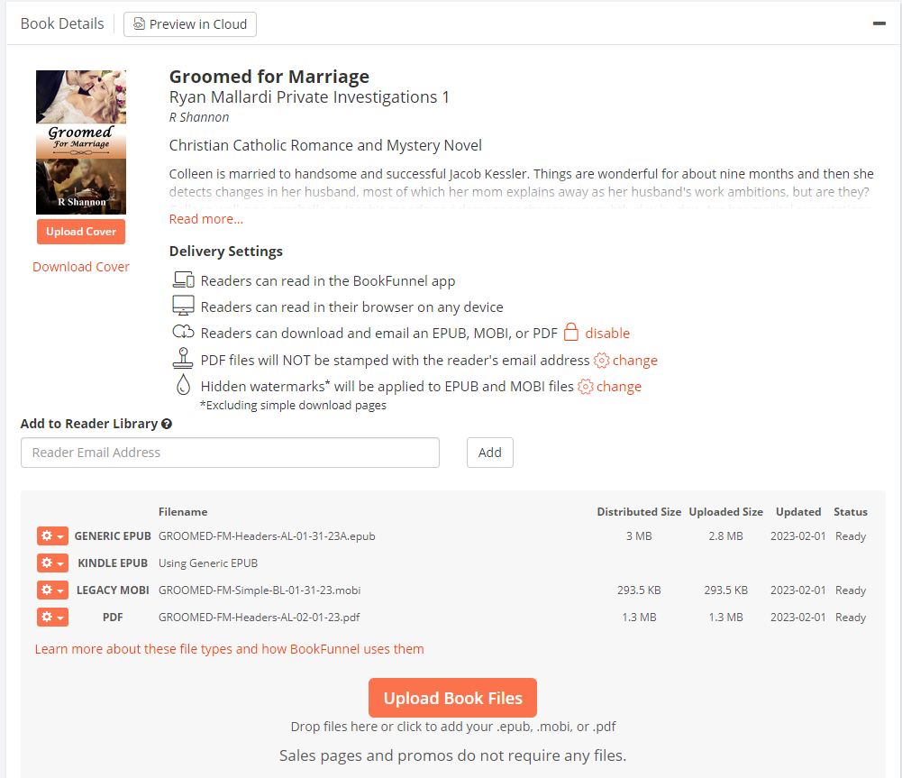
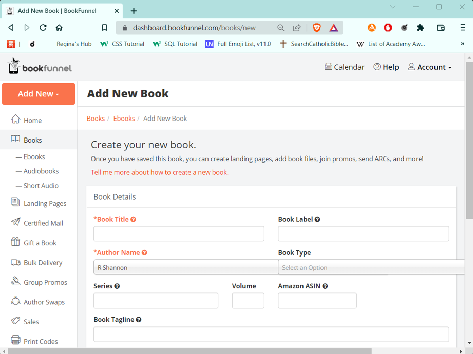
This is a screen shot from one of the books pages. In order to upload an eBook to Bookfunnel, you will need:
To offer a free-download, you will need to upload the book files as shown here. To enter promotions for sales of your book, you will need to create a landing page.
Above is a Google Chrome Extension that you can find in the Chrome Web Store. This one allows you to convert almost any document. However, it allows you to convert word documents to epubs and mobi formats.
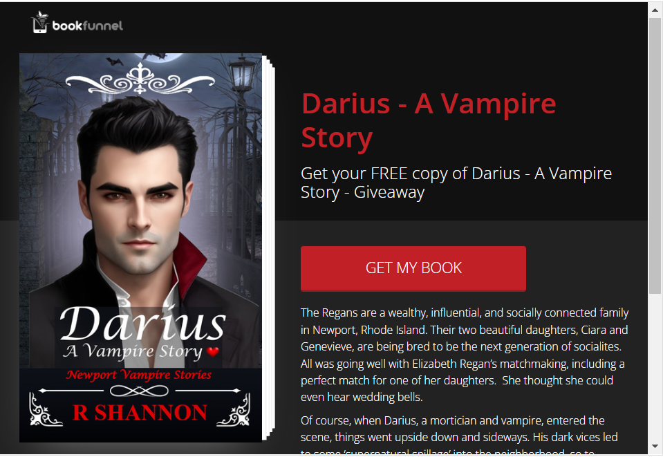
This is what a Free download page looks like. When you enter your book into a promotion and someone clicks on it, they see this page.
You choose the header, subheader and the book description.
In order to get the free book, they must sign up to your newsletter, and then verify their email. Then Bookfunnel delivers the book. Bookfunnel then either holds the email in a list that you download ($20 membership level) or it sends it to your list at Mailchimp ($100 membership).
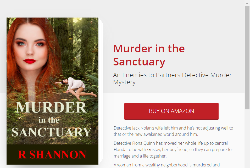
The books you list for sale will need to be set up on what Bookfunnel calls "sales pages". This was a bit confusing for me when I was new. To create a giveaway page, that seems to be as easy as just uploading your book and choosing to require the readers to sign up with an email. It's one or two clicks and you are done.
But the sales page, you need to click over in the menu on Sales Page. Then you will be led through with a widget to create your sales page. It's easy peasy. The confusing part for me was that I kept forgetting to click on "Create a Landing Page."
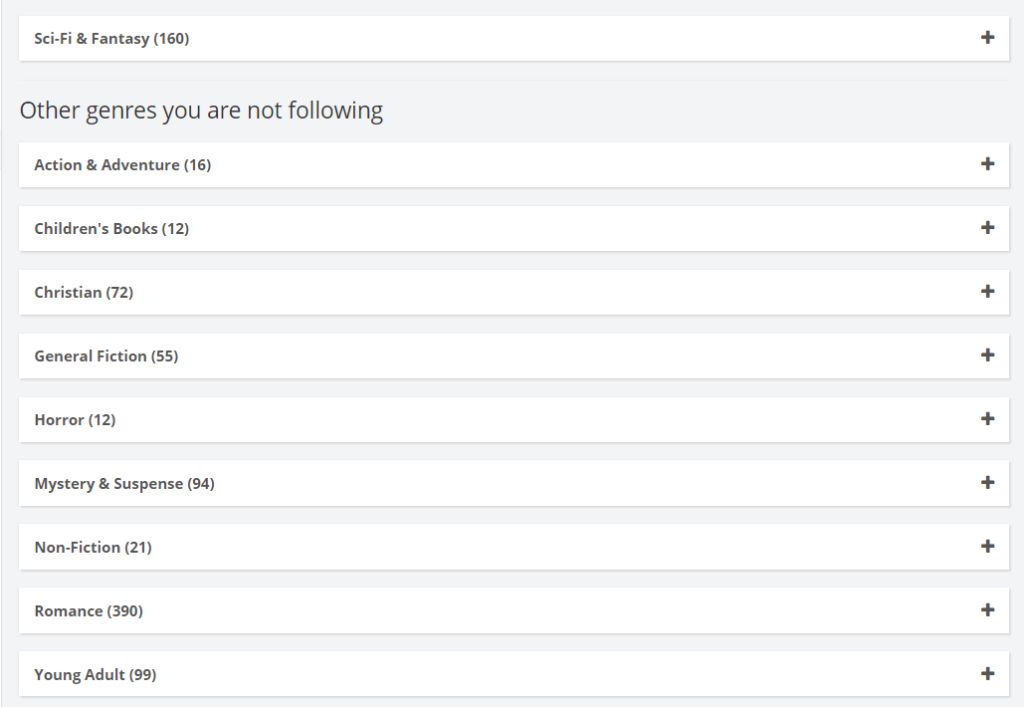
Above is a screen shot of the promotion genres that are at Bookfunnel every month. These are numerous promotions in each of these categories. When you click on the plus-signs, a longer list of promotions opens up in each of these categories. As you can see, just about every genre of fiction and non-fiction is covered.
The numbers in the parentheses are how many promotions are available in that category. Below we'll look at a category close up.

Above is an example of some of the promotions in the Mystery & Suspense category.
There are promotions for Sales, Amazon, Kobo, and some for Giveaways and also Kindle Unlimited.
I’ve been using Bookfunnel for about three years now and I’ve built a mailing list of 3,000 or so readers. In my humble opinion, this is the easiest way for a self-published author to market their books.

Bookfunnel also offers “Book Swaps”. A book swap is when you agree to feature someone else’s book in your newsletter and they agree to feature one of your books. This is a great way to get even more readers to see your eBooks.
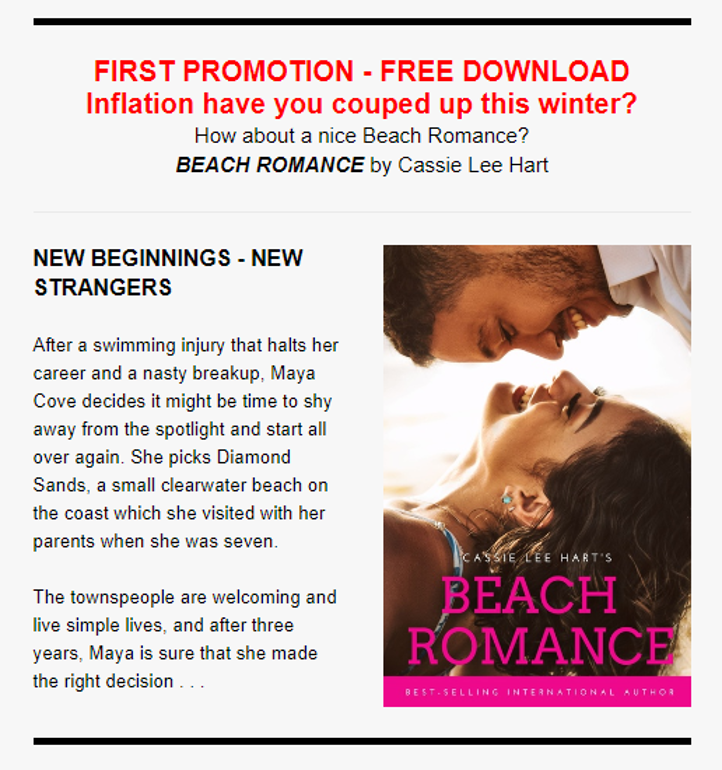
Below is an example of a “Weekly Feature” panel from one of my own Author Swaps.
That’s all you need to know in order to sign up with Bookfunnel to start a readership list today.
Whether you are marketing books or anything else, a mailing list is the most personal way to keep in contact with your client and/or customer base.
In our next video, I’ll show you all you need to know to sign up with Mailchimp.com, which is the other piece of this mailing list puzzle.
 Turn these Scrivener features off, especially if you plan to move your finished novel draft into Microsoft Word for final formatting. Because I self-publish and I need to upload in ePub and PDF manuscript, I use Word for a final proofread and formatting. I find Word is the best choice for me. The smart quotes do not translate well between Scrivener and Word. If you turn off the smart quotes, Scrivener will replace them with straight quotes and these translate better.
There is really no upside to using smart quotes in a novel. This is not a feature that will prevent you from leaving out a quote. It's really useless for an author, so its best to shut this feature off.
The sentence case correction will not allow you to add a lower case letter after a period. This doesn't seem like it would be a problem, but at least once during a first or follow-up draft there's a time when this auto correct starts wrestling with me when I'm trying to do something. So I shut it off now at the beginning.
If you search "auto correct" in the Scrivener help bar, you will be able to open up this feature and uncheck these two items. You'll thank me for it later.
Also, there is a whole layer of proofreading that I'll be making a blog post about in my Peek Behind the Novel series where I will show you how I use the find feature to check on every single quote mark. I've always had at least one or two that almost got away! So the smart quotes are nothing but a nuisance.
 I'm writing my fourth novel in the Jack Nolan Detective Series. The book is still unnamed. This is Level 4 in my Eight Levels of Writing a Novel series. This first draft is down and dirty. It is the hardest lift of the entire project. At least for me, the first draft is the hardest. The characters all seem like stick figures. I find them unlikeable -- even if I liked them in the last book! Any humor doesn't seem to work. Everything just seems awkward. I have to literally force myself to keep typing. So this tip is to just keep writing. Don't check on any spellings or grammar. Don't even look back. Just keep going until you have the crime down, the main plotline down and the subplots at least in place. That will complete the first down-and-dirty draft. Every other layer will be easy compared to this one.
 With bard.google.com, now it's possible to do research on the fly when writing fiction. Simply open a browser window, type in bard.google.com and start asking it questions.
Unlike ChatGPT, Bard is a Google AI product supposedly still in beta form, but it works like a charm. Unlike ChatGPT, it can research using the internet. ChatGPT is limited by time; the cutoff for ChatGPT the last time I checked was sometime in September of 2021 I believe. The cut off of what it can access is now way over a year ago. So I find that Bard is a better option for book research so you can get the latest.
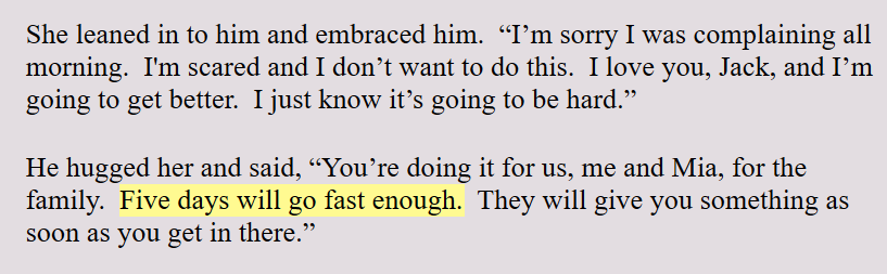 Scrivener allows you to highlight text in any color you want. I use this highlighter in the Level 4 Draft to make a mental note to myself to check on things. For example: If I say that someone is coming home from a hospital in four days, I highlight this. This makes sure that this lines up with the plotline, or the crime line, or the subplot lines.
As an author, I will often tweak the script, especially as I'm writing. It's too easy to forget this early reference to five days. By highlighting it, it's a reminder that this timing needs to line up with something later on in the story. I find this highlighter a great author tool.
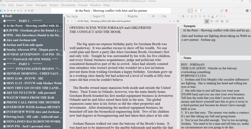
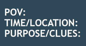 Like I mentioned earlier, I'm in the first draft of my novel and each scene begins with the same Scene Template as seen to the left.
I leave the POV, which stands for Point of View at the top of each scene during the first draft. I don't choose the POV before I write the scene. I write the scene and see which character claims the scene. Then I assign that one character to the scene.
POINT OF VIEW: By keeping the POV at the top of the scene, it's a reminder to me to make sure the entire scene is in this one point of view. I admit that I allow myself one small head jump at the end of a scene. I'm a self-published author, so I can indulge myself and get away with this. I believe a reader can handle one head jump at the end of a scene for the purpose of informing them of what the other character thinks at one time. I don't believe one head jump creates that big of a problem.
TIME AND LOCATION: By leaving the Time and Location information at the top of each scene, it is a reminder to make sure I describe the scene and whoever else may need a description in that scene. In Layer 5 of my writing system, I go through all the scenes and add descriptions of the locations and people. So this information makes that level of writing easier.
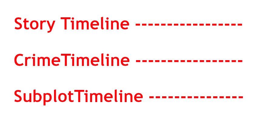
I write Christian mystery romance, private investigator mysteries and police procedurals. By leaving the timings in the header to each scene, it allows me to keep track of the story timeline. I am always keeping track of multiple timelines in each novel. I have the crime timeline. Then there is the timeline of the investigation and the dropping of the clues. And the subplots also have a timeline as each book has at least a small character arc. This is because I write in series and the characters have one small character arc in each novel.
So that's a minimum of three timelines that I need to track. So keeping these timelines at the top of the scenes as I go from layer to layer of writing, it makes it easier to make sure things are lining up on each timeline.
I keep these headers inside the manuscript draft until I'm ready to put the book into chapters.
There comes a time or two when I will decide to add a short scene or two. It may just be to have a change in the point of view or to get the characters to a different location. Whatever, it is, I use three asterisks between these two separate scenes. I also start the second scene with my normal Scene Template.
This allows me to know this is a separate scene and it will have a point of view. It also alerts me that I will need to insert a scene ending which I won't do until I bring the manuscript into Microsoft Word.
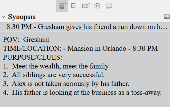 When writing the first draft, I use the Scrivener Synopsis section in the Inspector Pane to list the clues I have dropped in that scene. Once I've finished the first draft, I can open the project in Outline View and this will give me a bird's eye view and chronology of the clues that have been dropped.
Personally, I often also add background information that I dropped in the scene. I do this only because I have a tendency to forget whether I dropped that background information in the present novel or if my memory of dropping it is from the last novel I wrote!
This alone is a major reason why I love writing drafts in Scrivener.
So these are the tips I would pass on about writing this first draft of a novel. Knowing that it's the hardest allows me to know that once I make it through this first draft, all subsequent layers of writing will be easy peasy compared to this one.
All I need to do is to blurt out the entire story in the first draft. All corrections, additions, deletes and polish will come in later layers.
 If your research requires a public figure or an organization, start at Wikipedia and take advantage of research already done. It will all have to be verified, but you will at least start off with some basics.
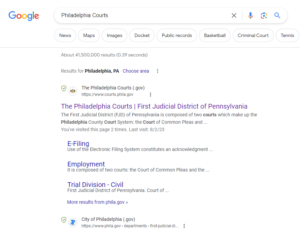 Go to Google and type in Philadelphia Courts or New York courts, etc.
From there, sub topics will pop up that are in rectangle bubbles at the time of this writing. This will allow you to begin to drill down to the type of information you are looking for.
This resource is not good for just a fishing expedition on someone or some company or organization. This is more for researching a court case you know took place, etc.
 It's important to know that there are at least four levels of record keeping in the USA. There is Federal, State, County, and then City or Municipal or Local. This will help when you are drilling down. It's best to drill down one layer at a time.
Here are four general public records to start with:
Often, public records can cot money to search, so save this for last. See how much you can get for free at other search sites.

Docusearch.com - this can get you want you want or need, but you will have to pay per search.
The search sites that offer court document searches are often held behind a pay wall. Its easier to see if you can come at it from a different gateway. Start in Scholar.Google.com and see if you can dig down one level at a time until you can obtain the information from another roundabout source.
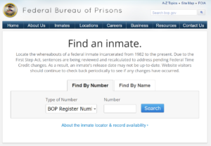
If you are not in a hurry, you may be able to find court records or at least relevant details about a specific case starting at the opposite end. You can search for any prisoner in the USA by searching the Inmate Locator.
Save citations as you research. This will prevent plagiarism.
Research is a wild run. There's almost no way to retrace your steps. So as you find information you may use, save the citations at the same time. You will thank yourself when it comes time to add a citation.
If you are researching a technical subject, it may be necessary to find an external source, someone with expertise who can review your work. As you do research, watch for academic names that you may be able to contact later for a confirmation of some other citation. Very often professors or their helpers like to be contacted for their seal of approval or certification of something.

 Another technique to researching over a period of time is to create a 'google alert' for a certain topic. Once you do, Google will send you a notice at hte end of each day with whatever articles are published or pop up in their search engines. This is a great way to find trendy subjects too.
For example: If you want to follow an ex-president to see what he is up to, create a google alert for Barack Obama or whoever you are interested in. If the person you are alerting for is very popular, you may be creating an avalanche of alerts for yourself, so use this sparingly and carefully.
Use Google Search and click on the Advanced Search. Then make use of the 'exact phrases' search and other filters.
For technical research, you can research the top journals and magazines in the desired field and then research their websites for specific keywords and subjects.
 Open access papers = www.oa.mg
Search in the Library Genesis Access Program:
https://wiki.mhut.org/catalog:search
PaperPanda is a chrome extension that can search for many papers
Unpaywall is another chrome extension that searches the web for your paper
There is a Reddit subreddit called /r/ scholar/ - Reddit subreddit where people exchange papers. You could probably get away with asking one or two questions.
 Using an incognito window, go to YouTube and research your
niche keywords. The reason you use an incognito window is so YouTube and Google don't recognize you and start showing you videos for you specifically. By going incognito, you will see what YouTube offers a new person with no algorithms.
After hitting search, then click on 'filters' and filter by channel.
This is a way to find channels that have built the highest number of subscribers. They will be a great source for subjects that are of interest to people in your genre or niche.
If there is a channel with 100,000 subs or up to a million subscribers, this is a confirmation that there is an audience and a marketplace for this subject.
 Click on several videos and watch for one minute and click off. This will teach the algorithm what you are interested in.
Then refresh your search at the YouTube home page. Now YouTube will begin to show you videos that are in your desired subject. Now you will see which videos YouTube chooses from all of the channels. Whoever YouTube Shows to a new viewer are videos and channels that are trending.
1. The videos or channels are being recommended in the YouTube home page
2. The video was uploaded less than a year ago
3. The number of views is higher than the number of subscribers.
Keep refreshing your page at YouTube and if you see videos that are being re-suggested to you, that's another clue that this is a popular video in your topic. It could be another sign that it is trending.
Find about three or more (up to 10 trending video) of these trending videos
Then begin looking through their video titles.
 VidIQ is an extension you can get in Google Chrome Store
Click on extension and install it.
Then when you are logged in and start looking at individual videos, it will give you technical information about the channel and the video like how many subscribers they have, their views, and their tags.
Jot down all the tags. This is a great way to know which tags are the best ones to use in your upcoming videos.
Check back again as I always update my research pages!
Open up about 6 videos so you teach the algorythums with your niche subject
Look for channels that have videos that are much higher
than their subscribers
 The answer to that question depends upon your goals as an author.
If your present goal is to simply publish your novel and let readers find it through traditional channels like a publisher or Amazon KDP, then the answer is, no, you don't absolutely need a website.
You can create an author page on AuthorCentral at Amazon and list all of your books as you publish them. This page can be accessed from any of your book description pages at Amazon.
However, if you have no goals of building a readership or branding yourself in any way, then you can operate with this Amazon Author page and a Facebook or Instagram page.
 If, however, you are a serious author working towards a career or life-long profession, then you will want a website. You may not need one with the first book, but you will be anxious to build your brand right away.
Some of you will have day jobs with extra money to purchase a website. Others will be raising kids and maybe money is tight. There are options for both of you when it comes to creating an author website.
If you are writing in a series, you will want to brand yourself more than most. You can operate on a shoestring for the first two or three books, however, so it's okay if you are operating on that shoestring. You can keep an online presence using your author page and one or two social page connections.
And if your goal is to work with a literary agent and write through a publisher, you can easily operate without a website.
 Although I have already said that you can write book series and operate with an Amazon author page, there will come a time when you want to brand yourself and your series. This will also help you build an online presence. It's all about competition. The more ways you use to run into readers online, the better it us for you and your books.
 If you want to connect with readers, or start building a readership, you will then want and need a website. When I say connect with readers, there are a few ways to connect with readers.
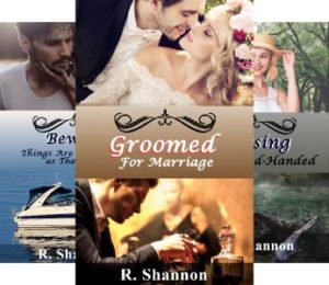 For whatever it may be worth to you, I would recommend that you consider a website by the time you have written a third book, whether it is in a series or not. Once a reader has read more than one book, they will get curious about you. They will want to see a picture of you and maybe learn a few personal things about your life. Having a website, you can share a little bit of personal information.
This is also a great way to allow readers to contact you. All websites have contact pages where a reader can email you safely and tell you about their experience reading your novel.
 If you will be self-publishing and are on a shoe string budget, then you will need a website, but you may be able to operate without one for the first year or eighteen months.
When operating on a shoestring, budget, you need to decide where you will spend the little money you have to operate on. So a website would not be a first priority for you, not for the first year to eighteen months.
I intend to do a whole blog and video series on how to create or purchase a very affordable website. For example, you can purchase a URL address (for $15.00 or so) and build a free website on a free site. Then you can use the URL to redirect to this free website. This is an extremely budget-friendly way to have a website.
So be sure to stop by as I am planning to do more blog posts about this strategy as well as building a one to two page website for authors with only one or two books.
What if I'm ready now? What are the first four steps?
 Step One: Find an affordable hosting company. You only need a basic plan. I use bluehost.com, but be sure to watch my video that I'll post here about how not to get into the trap of buying all kinds of services you don't need.
Step Two: If you only have one or two books, you can get away with building a small HTML-based website. I will also have a blog post soon, which I'll link here, as ot how to build that. It's easy.
Step Three: Create an email that matches your website. If the name of your website is CowboySue.com, then make sure you have an email like Sue@CowboySue.com. This gives you a professional look right away.
Step Four: Link your website to your Author page at Amazon Central.
Those are the first four steps in planning a website.
 Do you want to be a published author and work with a leading publisher? Or do you want the freedom of self-publishing? Either way, you will need to learn to do at least some book marketing.
As I've watched other YouTube authors grow, I've noticed that most of the girls and guys who have built a sizeable social media following on their own have gotten publishing deals. I can tell from being in the business world in general that this is now something that publishing houses look for. They want authors with initiative.
Authors who create an online presence are also proving that they are serious and career-minded. This too is something that the publishing houses look for. The idea of signing a young author with a lifetime of work to be published is a dream come true.
Gone are the days where the high-end and huge publishing houses are the gatekeepers to being published. They used to do everything but the writing for authors. Amazon KDP broke that model. KDP offered anyone the chance to publish a book. At first it disrupted the publishing business, and within a year or two, it completely took over the publishing industry. You know they took it over when even the publishing houses are advertising and selling on Amazon.
The big publishing houses could have been KDP, but they clung to the power and control of the gatekeeping model until it was too late. The last I heard, they were even having trouble holding onto their experienced editors because now even the editors are finding freelance work on their own.
 Don't worry if you are camera shy or introverted. The type of book marketing I'm suggesting here is for introverts. People who have these big boisterous personalities don't need anyone to help them gain a readership. Social media was designed for the extroverts -- even the narcissists!
The first phase of the marketing will be starting and slowly building a newsletter list. The next phase is to give away your book or market your book in other ways. Your choices will depend upon your budget. There are choices for those on a shoestring and also choices for busy people who want to buy services to move things along faster.
The following marketing strategies are all painless book marketing strategies. Even the shyest introvert can do these strategies as they don't require anything confrontive or aggressive. The trick is consistency. These strategies work if you are able to keep at them everyday and every week. They are so simple that adding them to any busy person's daily to do list will be a breeze. I know as an introvert myself that most introverts are capable of great consistency.
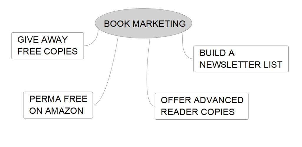
Above is a small diagram I prepared to give you an overview of how this first level of marketing works. In the beginning, this is totally free. It only begis to cost a bit of money when you build a readership of over 500 or 1,000 people. But then you will be selling books, so it will all even out.
When I was starting out, I was thrown by the term 'newsletter'. Every author video I watched suggested sending a newsletter. I didn't realize that 'newsletter' is subject to interpretation. I live a very quiet life and wouldn't have enough personal information to put into a newsletter. So that was a big obstacle for me.
However, in time, I started sending book promotion emails, offering not only my book, but other authors' books in the promotions. So whatever you choose to send when building your newsletter can be unique to you. You can decide what your newsletter will be.
For example: There are cozy mystery writers who write books about the food industry or baking. Those authors can include recipes or other things that would fit in their book theme. Mystery writers can send around some information about home security, or police stats. You can decide to add whatever it is that you are really interested in.
I send around a newsletter with eBook promotions that I enter or host on Bookfunnel.com and Siteorigin.com. I also alert my readership when my books are offered free on Amazon.com. I would recommend both of these websites.
 It's important to be clear that when building an email list, that email list is your readership following. You may have free book searches who get on your list, and they may unsubscribe after a month or two. But the readers who like your books and look forward to hearing from you will remain loyal to you. You are cultivating a following. You need to see marketing as a slow and steady way to build this readership and maintain a monthly or bi-monthly contact with them.
I recommend the first step to sign up at Mailchimp.com or any of the other free mailing list companies. There are many of them now. I don't believe Mailchimp is the cheapest choice like it was once was. They used to allow you free access up until your mailing list grew to 2,000 people. I'll have to do a search to see what other companies are out there. When I do, I'll do another blog post.
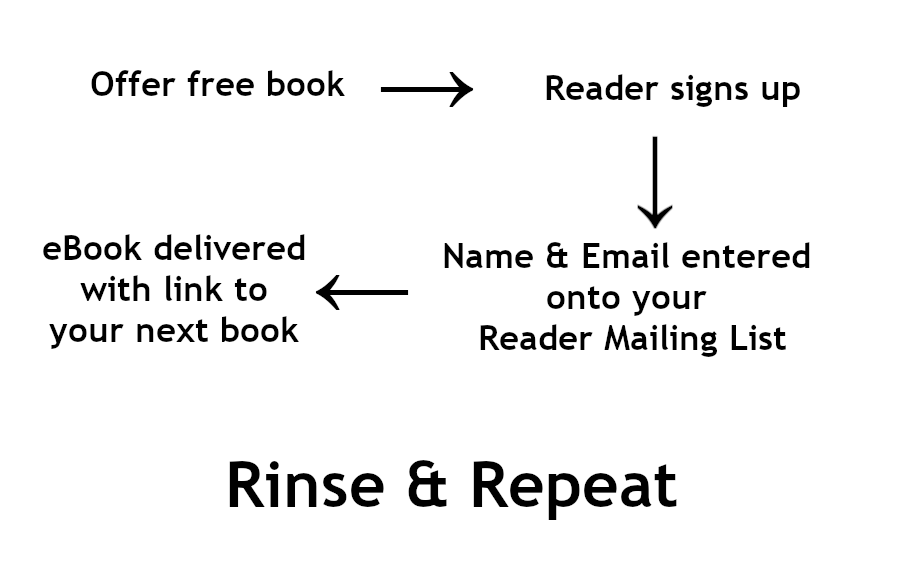
When you join Bookfunnel and SiteOrigin, you can offer your book as a free download. Promotions on these sites are for free giveaways, or book sales or Kindle Unlimited eBooks, or permafree books at other retailers. There are many, many choices. Each promotion is different.
By giving away your book, a person who wants the book must sign up to your newsletter list. Because this signup is handled by Mailchimp (or whoever your mailing list company will be) you just create the email from a template and the mailing service signs people up. It has them verify their email and they are signed up and you now have permission to send them follow up emails.
Consistently sending out new promotional emails and having people continue to sign up will allow you to slowly but consistently grow your readership. Adding this level of marketing into your weekly schedule is enough consistency to build a sizeable reader list. You will be amazed at how fast you can build.

Each book goes through the same cycle. It's written, and it finally goes off to an editor. Then when it comes back, you have changes to be made. At some point before you publish the book, you can offer it as an Advance Reader Copy. This is where you offer a free copy of the book for an honest review.
It's a good idea to give yourself at least 6 to 8 weeks before publication to gather readers so that when your book is published, you will be able to get reviews on the day or day after its published.
This is a great strategy and again, it's free. It's a way to not only build your reader email list, but also get reviews on your newly published books.
Another way to continually build a mailing list is to write novels in book series. There are many authors who started out offering their first book for free and then sold the other books in the series. This is a great way to allow readers to try out your books, see if they like your writing style.
Even Amazon will allow you to 'price match' for a free book on their platform. There are some conditions that have to be met, but nothing that's hard.
Most series has a certain read-through rate. If your books are good, you will have a high read-through rate and readers will be happy to spend on the follow up books. I'll also show you in follow up blog posts how to add a link to the next book, along with adding a link to leave a review for the book they just finished. It's all marketing and it all works.
Join Bookfunnel.com, SiteOrigin.com and Mailchimp.com. That's enough for the first six months to a year, especially if you only have one book. Give away that first book or offer it on sale through Bookfunnel and SiteOrigin. Within a year, you will build a mailing list anywhere from 500 to 5,000 emails. I know it sounds impossible, but the trick is consistency. Every month you need to continually offer your books for giveaway or sales.
The main reason you should give away your early books is that unless you have a readership already, like JK Rowling or Stephen King do, then you are competing with those authors. Why would a reader buy one of your books when they can buy a book by a well-proven experienced author? That's the main reason to be willing to give away books in order to build a readership.
Don't think of it as giving away your book for nothing. Think of yourself as using the book as a free way to build the first twelve bricks of your future readership. It's all in the way you choose to look at things.
I'm in the weeds!
 I am knee-deep in Level 4 of writing the next book in the Jack Nolan Detective Series. I thought this would be a good time for me to take a break and reflect on what happens when I'm 'in the weeds' writing a novel.
Even though all writers have a different writing routine, I would venture a guess that most of us feel some of the same fears and face some of the same obstacles.
 When you first sit down to write a novel, everyone is filled with enthusiasm and creative energy. It's exciting. It's new. But as the manuscript begins to grow, before it feels finished -- or even ready to be polished, it feels cumbersome, heavy, and overwhelming. At least for me it does.
Even though the story and plotline felt great at the beginning, there comes a point where a fear of failure sets in. Am I going to be able to finish this? Does this plotline even make sense? What happens if this storyline is not that great? Maybe this mystery isn't enough. Maybe the dots are not going to all connect.
 It's possible to get paralyzed by a fear of failure at any point during the writing of a novel. It's not a one-and-done operation. No one sits down, starts writing, finishes writing and ta-da, there's a book. Writing a novel doesn't work that way. It's a long process. It's a multi-layer process.
When these fears pop up, and they will, it's important to remember that many writers feel these doubts and fears. It's important to remember that everyone of us fails at something at some point in our lives. The good news is any novel can be redone, re-written, revamped, added to, or massaged in any number to go from mediocre to great. It's a work of art in progress until it's handed over to the publisher. Knowing this is empowering.
 Writers block is another common problem among authors. This often sets in after that initial period of excitement about the novel wears off. At some point the writing of the novel shifts into a project requiring some heavy lifting. There's always a phase or two where the author has to tough it out. We have to keep at it.
It's important to know ahead of time that writer's block may set in at any time while you're writing. I find that deciding to just sit down and go over what I've written 'to get my place' or to 'get into the flow of it' is enough to get over any writer's block. Just by sitting down and starting to read through it, the project recaptures me. Even on days I feel I have nothing in me, I can suddenly be pulled into writing before I even know it's happening. If you can commit to look at your project for fifteen minutes, this can be enough to recapture your enthusiasm.

Many wannabe authors have busy lives and don't have a lot of time to devote to writing. There are certain years -- especially in a parents' lives --where raising kids is more than a full-time job. But where there is a will, there is a way.
There are ways to steal away an hour or two in any given day. It does, however, always require some level of planning. Don't be afraid to plan writing time into your day and give it a higher priority than 'the back burner'. Even if you are a parent or a caretaker, pursuing your own dreams is important. It keeps you engaged in life. It makes you a better parent. It can even make you a better day worker. Think of your writing as your own personal mission in life.
Perfectionism can be another stumbling block for authors. Everyone wants to write a masterpiece. But at some point, you need to also know that nothing in life is perfect. Don't let your ideas of perfect get all wired into your ideas of excellence. They are two different things.. If you looked close enough, you could find a few imperfect brush strokes in the Mona Lisa. If you read Harry Potter enough times, you may catch a plot hole or two. It's important to know the difference between excellence and perfection. One is doable and one is not doable by human beings.
 Will my readers like the book? Will the book be good enough to get a literary agent? What happens if my book gets bad reviews? There are any number of fears of rejection that can cause us to stop writing. Decide ahead of time you won't allow these fears to stop you. Like I said earlier, think of your writing as a mission God has given you. This is your life's work, along with your other worldly responsibilities. Your writing could be an opportunity to pass on things you have come to learn in your life. That's a purpose. Or maybe writing is a way for you to share the gift of storytelling that you know you were born with. That's a God-given purpose. Whatever the reason, it's important to not allow fear of rejection to get in the way.
Self-doubt is a tool of the devil. It's easy for any human to start thinking they aren't perfect, so maybe they aren't good enough to pull off writing a novel. And the reason I call it a tool of the devil is because it can start with just a tiny little insignificant thought of self-doubt. But it can snowball and get bigger and bigger and bigger.
During these times when I feel self-doubt, I think of my writing as therapeutic for myself. It's something I'm doing for me, not for anyone else. Any fear of rejection that occurs, thinking I'm doing it for myself, it takes away any sting self-doubt may have. It removes any power it has over me. It turns the tables on this.
 Distractions are one of the biggest obstacles to completing a novel. One reason is because life does serve up constant small and big emergencies that have to take first priorities in our lives. So an emergency distraction can throw a whole well-planned writing schedule up into the air in a heartbeat.
One of the weapons against distractions is get clear on what a real emergency is verses a situation that can take its place in your daily routine. You don't always have to sacrifice your writing time just because someone else doesn't have to wait or suffer a small inconvenience. Always ask yourself whether you have the right to protect your free time or whether you are dealing with a true emergency, a situation that requires you to replan in that moment.
Parents with kids can fall into a trap of giving up all their free time based on a constant stream of kid demands. Giving in to every child whim is not the definition of a good parent. Protecting your free time and expecting your child to work within your schedule is not bad parenting. It's the sign of someone who is good at balancing their lives.
I learned a long time ago that I have to protect my free time as there are armies of people in the world who would harness me as a free resource in their lives. They would demand and expect that I do all the things they don't want to do if I allowed it. We're responsible to set our own boundaries with people, and that includes kids.
 Most novels require at least some research. The internet can be a blessing with research but it can also be a curse. It's a blessing because the days of having to travel to a public library are over. It can be a curse because the research can suck you in and you can use up all your valuable writing time doing too much research.
The tip I would pass on to any new writer would be to not do the research until you have already laid down your plotline. This will avoid research for things that wind up on the editing floor, so to speak. Subjects or issues you you think may come up in the story may get cut as you firm up a plotline to fit within the space of a novel. There's nothing more frustrating than looking back and seeing hours and hours of wasted research time.
Too much research can also lead to another problem and that is 'information dumping'. That means that many authors can't resist the opportunity to write into the story things they learned from their research that are not really relevant to the plotline. This may be fascinating to us as authors but it's boring to readers if it doesn't move the story line along.
 Another trap to finishing a novel is to get caught up in a never-ending edit of the book. This usually hooks in with perfectionism problem in some way.
I break up my editing into stages so that each time I go through the book, I focus on only one thing. For example: The first edit is to check to make sure I have put my descriptions of locations and people in. The second time I go through it, I look at sentence structure and make sure the chapters flow without any time gaps. The third time I pass through, I look for verb tenses. The next level is looking for the words I like to use too much like okay and just.
By having a solo focus, it prevents you as the author from getting caught in changing everything all at once. This prevents you from being able to focus on anything.
 Once you complete a novel, there is a little sadness that sets in. This book is no longer your baby. It's no longer your little pet project. Once you hand it off to an editor, it becomes a shared work, so to speak.
Very often, authors who have abandonment issues or fears of depression, they don't like to end anything and that includes writing a book. When I hear people saying they took seven or ten years to finish a book, I'm astounded at what could have taken them so long. They kept the book as their little baby for an entire childhood.
My Peek Behind the Novel series is about writing in layers. I feel that writing in layers is a way filled with techniques that keep me writing, keep me on track, keep me on schedule, and allow me to complete the novel, no matter how much research it requires.
These are just a few of the obstacles that we, as writers, face when undertaking the writing and completion of a novel. If your goal is to write a novel, don't give up on your dream. Keep writing, keep pushing yourself, and eventually you will complete your novel.
 When writing your book, especially if you are writing in a management system like Scrivener, it's easy enough to keep track of your manuscript.
However, once you compile the manuscript and pass it onto a beta reader, or an advance copy reader, or even an editor, suddenly, there are now 'multiple copies' of the same manuscript.
Then once your manuscript leaves, you should shift over into marketing mode. You will start creating graphics to use in marketing your book, or you will be working on the ebook cover or even the paperback cover.
You'll have original royalty free pictures, and then you'll have various copies of those oncoe you remove a background or two -- you get the picture.
Pretty soon, you have 25 files, some graphics, some blurb files, etc.
Below is a list of the documents you may accumulate just starting after you pass your manuscript on:
This is just a sampling of how many documents you will begin to accumulate.
The only document that is precious and that needs to be tracked like a hawk is your "present final manuscript".
A present final manuscript is just that. It's the last true final manuscript as of today. You will make changes after you hear back from advance readers and you may make other changes after you hear back from your editor.
My biggest tip is to use a date on final manuscripts. So if you are fearful of throwing out previous final manuscripts -- as most writers are -- you can be sure that a new final with a later date is a more recent final.
I also put the actual final manuscript that I upload to KDP in it's own folder called FINAL MANUSCRIPT UPLOADED TO KDP. Then I also date the final manuscript inside that folder.
This is an added safeguard so you don't wind up making new changes to an already older manuscript. Trust me, I'm speaking from experience unfortunately.
I'll share below my naming conventions with a few explanations below:
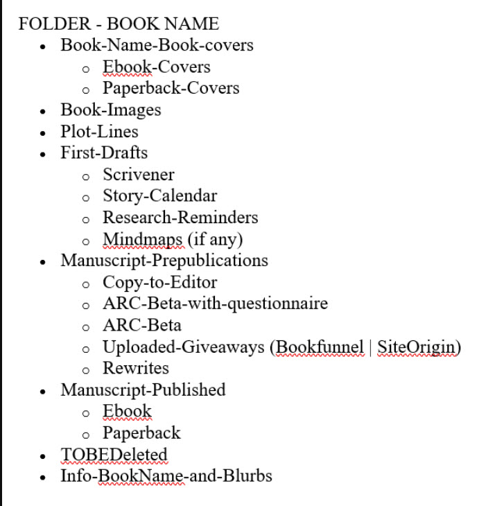
Most of the above files are self-explanatory with the exception of two or three. The reference to Bookfunnel and SiteOrigin are two websites that I use as a self-published author to market my books. I give away free copies of my new book the six to 8 weeks before publication. I often have a giveaway in them for taking the time to fill out a questionnaire about how they enjoyed it. So that's a different "final manuscript".
The other file that may need some explanation is "TOBEDeleted". I am paranoid about deleting anything before publication. So the old final manuscripts or anything else that I know I don't want or need, I put into the TOBEDeleted file. Once my book is safely published, I then delete everything at that time.

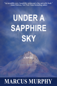 At some point your manuscript will get closer to publication. At that time, you will need to start thinking about dressing it up for publication. The book cover. You can find any number of places, including KDP itself where you can create your own cover for free. Not recommended, but it's possible.
If you are writing a non-fiction book, you can probably get away with using the KDP cover creator as the non-fiction books are more 'content related' than fiction.
Every new author begins to have visions of scenes they want etched onto the front of their book while writing it. I personally did the same thing. The book cover doesn't have to reflect any scenes from the book. The book cover is more sales pitch than any type of a summary or hint at what the book is about.
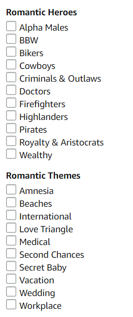
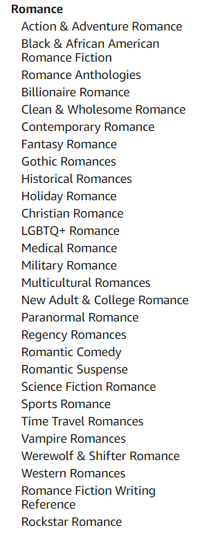
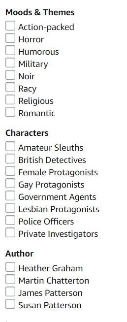
Answer: Genre and mood. Genre or theme. That's what should guide your choice in a book cover. The best practice for a newbie self-publisher is this: Find your genre and then see if there is a sub-genre where your book fits. Above you will see some of the subgenres under romance and some under mystery, thrillers. Finding your exact niche is what you want to target before you set your heart on any design.
What does this mean? Let me explain for the ultra newbies. It means that romance is a large genre by itself. However, Amazon has created all kinds of subgenres under romance like billionaire romances, cowboy romances, small town romances, etc. With all the analytics in the world, Amazon knows that people tend to like the same types of books, and by having these subgenres, it's now easy for people to find exactly what they want. As a new self-publisher, you need to make this work for you.
I wrote a vampire series that was really best suited as a paranormal romance. I never heard of paranormal romance. I didn't even know they had a paranormal romance genre. I was operating on the antique system where all vampire books were in the horror section. WRONG!
Not knowing all this, I originally designed a cover for "gothic vampire". Big mistake. I'll go into that experience a little more as I explain how to work with fiverr and still maintain control over your design. My point here is that I found out too late how important these sub-genres were. I had already paid for a fantasy gothic cover. Then when I went to change it, the fiverr designer who charged only $50 a cover now wanted $250 a cover. I had four books in my series! More on that in another blog post.
The way this became a problem for me was that my book covered looked like a high fantasy horror, but there wasn't enough blood in my story for that genre. My vampire series is more of a paranormal romance, a modern family drama. So it just was on the wrong shelf, so to speak. The cover was the main problem. It said gothic and it wasn't projecting the right "genre" or the right mood.
I have since fixed it, but it was an expensive lesson I learned the hard way. Anyway, I think you get the drift that knowing what book shelf, so to speak, you are designing for is very important.
TO SUM UP: Find your genre first and see if you also belong in a sub genre. Then search out this sub-genre best seller list on Amazon and look at all the covers there. Pick two of your favorites. They will be your inspiration covers.
The answer to this question is determined by your budget. In the world of self-publishing, there are dozens of companies and freelancers that serve the self-publishing community. They do everything from ghost writing, editing, book covers, marketing, social media and more. You can spend a small or even a large fortune on these services -- and you may be in a position to do that. If you are, good for you. If I had all the money in the world and had it all to do over again, I would get a publishing coach who could hold my hand and direct me on the path the entire way. I would make sure this consultant was an editor first and consultant secondly. This is probably the least stressful way to self-publish.
One Word of Caution: Be careful as you choose services to help you as there are good companies and some shady companies.
However, if you are publishing on a shoestring, then you've come to the right place. Keep reading as there are two different routes you can take, each will be determined by how much of a shoestring you are operating on.

If I had to make one recommendation to new self-publishers, I would tell them to spend their money on a good line-editor and learn to do the other services yourself. It is possible to find an excellent freelance editor for four to five hundred dollars. If this is the main expense of publishing a book, that's still considered a reasonable budget.
Don't worry if you are a single mom or supporting a family and you don't have a spare four hundred. If there are kids in your house, I can only imagine how fast they can eat money! I operated on less than $400 in the beginning. I've got you covered below.
 With Gimp (free graphic design program) and www.pixabay.com, you can teach yourself how to create a great cover. It's not necessary for authors to learn every single tool in the Gimp program to produce a great cover. You merely need to learn how to remove a background, blend pictures together and a few other easy-enough techniques.
I'm producing a Gimp for Authors Series to teach only enough to make a cover. This reduces the learning curve drastically. Look for my Gimp for Author videos on YouTube.
 Now another paid but affordable route to making your own book cover is to work alongside someone at Fiverr.com. There are lots of people who will create a nice book cover for $25 or $50. This may be worth it for some of you who are busy and don't have the time to learn Gimp. It always comes down to money vs. time.
 Join www.fiverr.com. Search for book cover design. Each graphic designer will have a portfolio of some kind. They all also have a rating based on past jobs. Fiverr is the go-between. You pay this person through the website. Fiverr protects both people in the deal. They make sure you pay when the work is delivered and they make sure the person who has offered to do the work has done it as agreed. So it's very safe.
 If you can, reduce what you need to have done down to a single task. For example: If you ask them to create an entire book cover, they will own and control the entire design. You will have no idea what they did to create it, how many components they used, what font they chose, etc. If you want to tweak it down the road, it's impossible to do on your own.
However, if you learn enough graphic design in Gimp to create the components used in your cover, know EXACTLY what font you want, then you can only pay for one or two tasks: Can you remove the boring sky from this picture and add this nice one? Can you turn this picture of guy into a silhouette and put him on a transparent background for me? That is much cheaper work than: Can you make me an original book cover?
As long as you can arrange your graphic components onto an eBook template in Gimp (beginner level task), then you can control your expenses and keep them very, very low.
Below is a video where I jump into Amazon.com and show you how to find the subcategories. It's not that easy anymore! This will help you, as a self-publishing author, find your niche category. That's Point A. From there, it's easy to find a template book cover from one of the many you will see. With that template, you are less than 10 Gimp techniques away from creating your own cover.
