Diary of all blog posts – Page 19 – Read First Chapter.com

Gimp for Authors – Basic Tips I Wish I knew When I Started

Gimp-logo-from-siteGimp is a free graphics program and it's fairly easy to use.  But a lot of the program is not self-explanatory.  So you can get lost really easily.  A graphics designer needs to know how the entire program works.  For authors, writers and other self-publishers, you only need to know a few of the tools to do pretty much everything you need to do.
The purpose of this blog post and video below is to give an overview of what authors will need to know about Gimp in order to be able to make social media posts, ad banners and book covers.

OPEN A NEW DOCUMENT VS. OPEN AS A LAYER:

Once you download the software, you will open the program and your first move will be to 'create a new image'.  Click on FILE > NEW IMAGE.  This will open a new dialogue box.  Fill in the dimensions of how big or small you want the image to be.

PPI - This controls how big the image is.  If you are creating something for a printer, or a paperback cover, you need to fill in 300ppi.  If you are creating a social media image, fill in 72ppi.  Printers need BIG pictures and the internet likes smaller pictures because they are easier to pull up from the servers.

HOW THE LAYERS PANEL WORKS:

All images are created in layers.  The layers are built up one over the other.  This is another reason why transparency is important -- which I'll cover below -- because you don't want to cover up the image or work below the layer you are on.

If you don't see your layer's panel open with the default settings, click on Windows > Dockable Dialogue Boxes and Layers will be one of the first choices in the long list of choices.  You can get to it by using the shortcut key Control L.


CHANGING COLORS FOR TEXT:

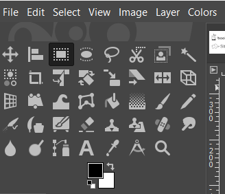
The graphic to the left is a closeup of the tools panel.  Each tool is represented by an icon.  Below the tools is a graphic representation of your foreground color (the color on top) and the background color (the color in the back).

When you open a blank layer, it will default to your chosen background color.

The text tool uses the foreground color.  So if you want to create a layer of black text, click on the text tool, click where you want to type on your image, and the text will render in black.

However, if you want to change the color of your text, before you click on the text tool, click on the black foreground color icon, and a color box will open.  Choose another color and then click okay.  Then click on the text box and your text will render in that color.

TIPS ON USING THE TEXT TOOL:

The text took can be tricky for a beginner because you can't as easily use the shortcut keys.  For example, if you change your text size and then click on M for the move tool, it only adds an 'm' next to the text size.  This can drive a new user mad!  So be aware of this, that the shortcut keys can be a bit tricky when using the text tool.

It's best to click out of the text box and then click on the move tool icon.   I wish I had known this when I first started using Gimp!

USING THE ALIGNMENT TOOL:

In order to align everything in the center on your image, you will need to use the alignment tool.  There are two steps in using the alignment tool.  Most tools are as easy as just clicking once on them.  However, when using the alignment tool, click the tool to make it active.  Double click to bring up the tool box.  Then choose to associate this to the background layer.  Once it has been assigned, then you click inside the image to the area you want to align.  Four very tiny dots will surround the object you are about to align.  These tiny dots are easy for a beginner to overlook.  Once you see these tiny dots, then you click on the 'center' or 'left-align', etc. inside the tool itself.

When you see the video below, you will see it in action and it will become clearer.

SAVE VS. SAVE AS VS. EXPORT AS:

There are three ways to save documents.  I'll post below the three ways and when you want to use that particular save:

  1.  Save or Save as - This saves the image as a .xcf document.  These documents are only recognized by the Gimp program itself.  You may want to save a social media image you made as a .xcf document.  This way, when you open it, you open the document and all the layers you created.  You can easily reuse these files to make future social media images.
  2. Export as - In order to use the images on the web or even send to a printer, they will need to be saved in the proper format.  So you will save as a .jpg or .png for the web.  If you have a job that a professional printer will use, you will most likely have to use a pdf.


SPECIAL INSTRUCTIONS ON SAVING FOR GIMP BEGINNERS:

It's important to know that .jpg images do not allow transparency.  They will default to having a white background.  .png images do allow transparency backgrounds.  This means that if you have a round logo with no background, you need to save it as a pgn file.  Otherwise, it will throw in a white background if you save it as a jpg.

Now, there is a little glitch in Gimp for saving PDF files, especially when saving book covers.  The work around is to save the book cover as a xcf document for safekeeping.  Then save it as a jpg file.  Open the jpg file and then save that as a pdf.

If you just save the xcf file as a pdf, it starts throwing thing into different places.  It took me hours and hours to figure this out, so I'm passing on this tip to other beginners!  Save as a jpg, then open the jpg and save that one layer document as a pdf.

HOW THE TRANSPARENCY WORKS:

In the project below, the Banner for Bookfunnel, you won't really need to now about the transparency layers.  But I offer this as a beginner tip.

If you choose to make an image and choose the transparency layer from the getgo, then each layer above your first layer will also be a transparency layer.

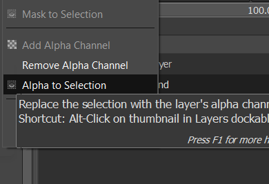
However, if you just open the document and try to add something that needs a transparency, it will cause a lot of frustration because the transparency won't work.  If you do this, open with a white or black background, then go over to the layers panel, right click on the layer and select "add alpha channel".  When you do this, nothing will happen, no noise is heard.  It feels like nothing happened.  But it did.
If you then click over into the image and then click your delete button ono your computer, the background color will disappear and in its place will be the grey and white checkerboard, as seen above, which represents the transparency.

For your convenience, I have posted the time stamps for the how to video that follows in case you want to watch a short clip more than once.

Video Timestamps:

00:01 - How to properly size a graphic
01:19 - How to open a picture vs. how to open a picture as a layer
02:00 - How to resize an image with the scale tool
03:15 - The layer's panel - How to find it - how it works
04:00 - How to change text color with the eye dropper
04:33 - How to use the text tool, a text box, and create a headline (T)
05:02 - How to resize the text size and make two text lines
06:02 - How to use the alignment tool (Q)
07:00 - How to move the text box (M)
07:21 - How to save the graphic as a XCF document (Gimp document)
07:58 - How to export the graphic as jpg/png graphic for internet
08:30 - How to save your project as a Template and reuse it
09:36 - How to turn a black background layer into a transparency layer


Author’s Resources – HTML and CSS Cheat Sheets

WHERE CAN I FIND THESE CHEAT SHEETS?

WHY WOULD AN AUTHOR OR WRITER NEED THESE WEBSITE CODING SHEETS?

If you're an writer or fiction author and you either have or plan to have a website, it's only a matter of time before you will need to know at least a little about HTML which controls the structure of a website or CSS which controls the style of a website.

This website, overapi.com, has AMAZING Cheat Sheets for these languages as well as many others!

Just look at how much work went into theses!

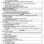
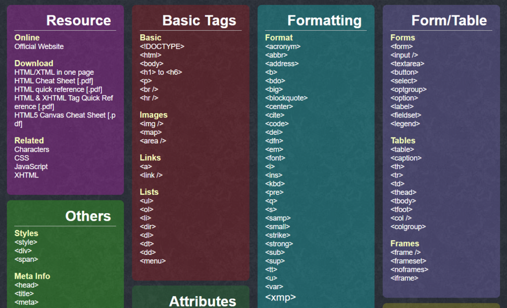
Above is only the HTML Cheat Sheet. This is only a screen shot.  The sheet goes all the way down the page.  The only coding you will need are at the top.  I remember wanting to change a background color, or change the size of a headline, or add more or less margin or padding space and these came in so handy.

You will only need one to three sections on each of the cheat sheets to have everything at your fingertips.

This resource came in so handy when I put up my first website.  I hope it will come in handy to new writers and authors who 'need to tweak' just like i did.


Self-Publishing Tip – Cover sizes

Cover Sizes - Which Comes First?

I chose to write this blog post for new authors who struggle, like I did, when it comes to getting things together right before self-publishing your own books.  I managed to flip upside down when it came time to uploading and publishing.

One reason I went upside down was because I was nervous about doing something I wasn't familiar with.  The second reason was that I had done so much research that I was overwhelmed with information and I had the information in different places.  Sheer confusion.

WHAT DO YOU ABSOLUTELY NEED TO UPLOAD AN EBOOK COVER AND A PAPERBACK COVER ON KDP.AMAZON.COM?

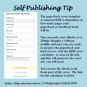
The ebook cover needs to be 2560px (height) x 1600 px (width).  The instructions say the ebook only has to be 76 dpi, but I always make sure mine are 300dpi.  It's just more high quality.  Amazon has a way of compressing them and they always look good online, so I would suggest you do the same.

It's all about the size.

76dpi, 150dpi and 300dpi - What's the difference?

The difference is size in dots per inch.  Without getting too technical, which isn't necessary, 76dpi is the most common size to use online, on websites, anywhere that you want your pictures to load fast.

150dpi is a bigger size, and that is seen sometimes online.  But that would usually be used for someone publishing actual artwork or photography.

300dpi is what a printer would need to print a color copy of anything.

72 dpi is referred to as "low resolution" and 300dpi is considered high resolution.

IMPORTANT LINKS TO KEEP HANDY:

Amazon offers a Cover Creator, but the covers are template based and it's best to learn how to use Gimp or some other free graphics program in order to make a cover.  They aren't hard to do.  Stay tuned for videos on how to easily make a cover.

The information about formatting in general begins at this link.

The paperback calculator is at this link.


Writers Diary – Pantser vs. Plotter

CHOOSE A PATHWAY:

I was lucky when I started as I knew, without a doubt, that I was a plotter.  I don't write a letter without a short list of points I want to cover.  But this can be a choice that can help you not get lost in the overwhelming number of things you need to keep in mind for any novel.

I won't go into too much detail as there are hundreds of youtube videos about being a pantser and being a plotter by more experienced people than me.  But in one sentence, a pantser is someone who sits down and begins writing 'by the seat of their pants' without an outline or a template of any kind.  Steven Kind is a pantser.  Being a plotter means that you start with a template, and then an outline, and then begin writing the novel itself.

There are natural-born pantsers like Steven King, and if you are one of those, that should be your pathway.  However, my suggestion to a newbie writer, especially if you don't know if you are a pantser or plotter, is to  try to at least have a template and at least three-act play structure to keep you on track.

#WRITERS TOOL - MYSTERY TEMPLATE

mystery-novel-templateThere are probably hundreds of templates out there for you to choose from.  If you search "writing template" at images.google.com, you will find hundreds of them.  I incorporated several of them into my  own custom Mystery Template.   You can click here to download the template to have a look at it or use it.

This is the template I wound up using after at least a year of struggling with the other confusing templates.  In time, I began to use a template that was divided into four acts, so to speak, but I'll talk about that one next.


Adding a Contact form with Recaptcha

Sick woman at work with headache

I started to get some spam through my website and it was all similar.  They were filling out the form for an advanced copy of one of my books, and then it had a weird message in another language.  It was most likely a bot, so the time has arrived for me to attach a recaptcha to my forms.

I had done this several years ago, but as usual, everything "updated" and my old instructions were useless.  So it took me about four hours to figure out how to add a recapture to a Contract 7 form and this blog post is an instructional on how to do it.

FIRST THINGS FIRST:  WHAT YOU WILL NEED:

recaptcha-picture-board
Recaptcha Picture Board
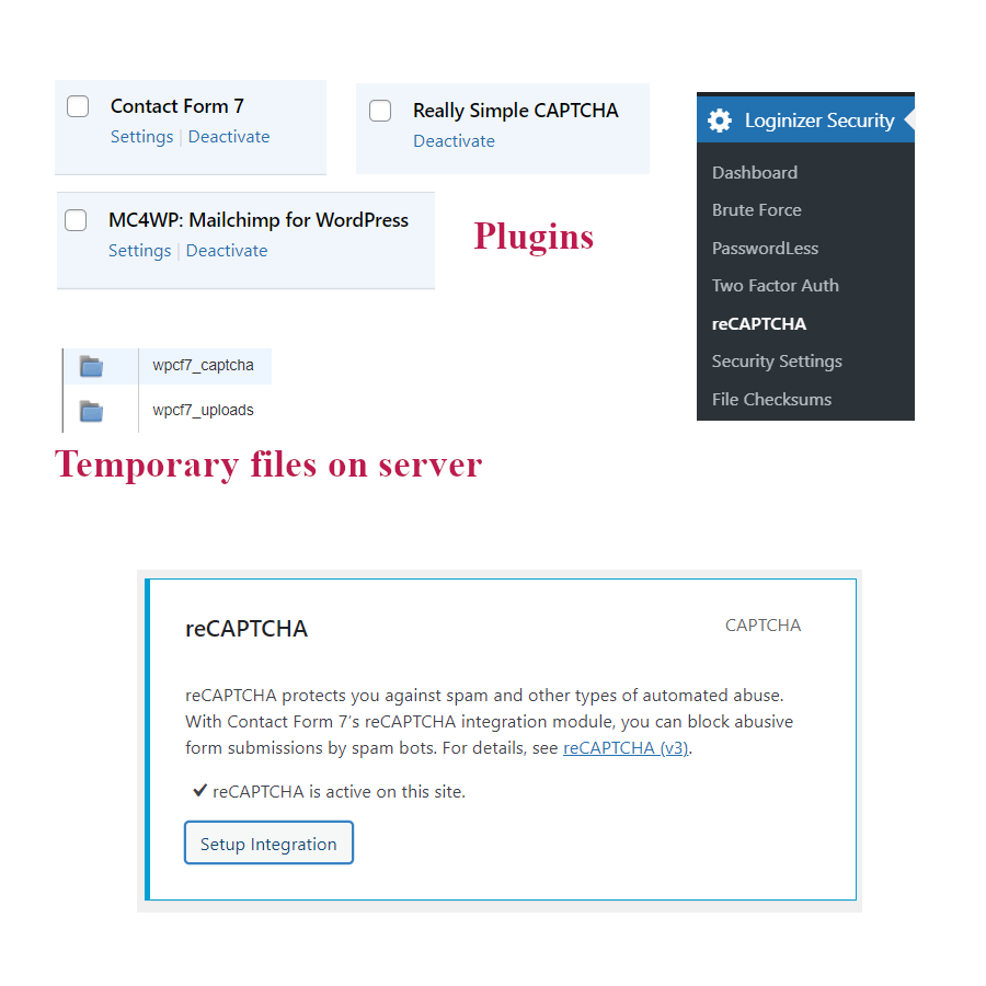
  1.  You need to add two plugins to your wordpress website.  Contact form 7 and Really Simple Capture.    As part of the Really Simple Capture, this should upload a temporary folder to your server entitled wpcf7_captcha and another one called wpcf7_uploads.  Photos of all of these are on the picture board above.
  2.  You will need to register your website with google to use a recaptcha, so go to www.google.com/recaptcha and fill out the form to register your website.  More on this below in the actual instructions.  As part of this process you will get a Site Key and a Secret Key.  You will need to copy and paste these somewhere safe so you can retrieve them later.  You will also get a google recaptcha admin page link and you may want to record this too in case you want to watch and see what kind of bots it blocked from your site.  But that isn't crucial to get it to work.
  3. Now, somewhere along the line, I wound up being redirected to a website called Softaculous.com for and had to pay to 'join' to use the captcha, but I am not sure if that is absolutely necessary.  It cost $24.00 for the year and I decided that I send enough emails and get enough traffic that a $24 service fee was more than reasonable, so I purchased it.  This may have happened to me because I was engulfed in a lot of confusion going from plugin to plugin and back to google captcha, so all I can say is good luck!.


HOW TO INSTALL THE RECAPTURE AND LINK IT ALL TOGETHER:

  1. First, inside the back end of your wordpress website, click on the Loginizer Security and you will get a drop down list.  On the Dashboard page, you will need to enter the Loginizer License number and click 'update'.
  2. Then click on the Loginizer reCAPTCHA settings.  This is where you will add your Google keys, both of them.
  3. Then click on Contact on the left hand wordpress menu and you will get a pop out menu.  Choose integration.  When it opens, click on the second box that says reCAPTCHA and this will add your google keys automatically and that will hook up the Really Simple Captcha to the Contact form 7.

HOW TO USE THE CONTACT FORM 7 WITH THE reCAPTCHA:

Here is where it got tricky and where I wound up going in circles for awhile.  The instructions are written for web developers and they assume you know a lot of things about hooking things up, which I don't know and you probably don't either.

So here are the instructions for fifth graders:

Once you have all the plugs ins installed, all your user keys inserted and integrated the form under Contact, then it should work without a hitch as long as you put the right short codes in.

The short code is this: [captchac captcha-170] [captchar captcha-170 4/4] This code will work without a problem.

FOR FURTHER INFORMATION:

If you want to read more about how it works, I had to visit all of these pages as I pieced together how it worked.

Contact Form 7 Recaptcha:
https://contactform7.com/captcha/
https://www.google.com/recaptcha/about/
https://www.google.com/recaptcha/admin/site/464233367
https://developers.google.com/recaptcha/docs/versions
https://loginizer.com/docs/getting-started/upgrading-from-the-free-version-to-pro/

The following 'different' codes seem to change the css or other things, so if you want to experiment with them, here they are:

[captchac captcha-170]
[captchar captcha-170 4/4]
[captchac captcha-778 size:s fg:#ffffff bg:#000000]
[captchar captcha-778 4/4]
[captchac captcha-118 size:l fg:#00ff00 bg:#ffffff]
[captchar captcha-118 4/4]


What You Need to Set Up a PPC Campaign on Amazon

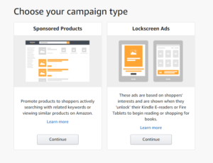
amazon-ppc-choose-campaign-typeLog into your KDP account at Amazon and click on the tab for Marketing.  Your first choice will be to choose between a sponsored ad or a lock screen ad.
Today we are going with a Sponsored Ad Campaign.  This is the one where you can use similar products and/or keywords.

Create Your First PPC Campaign:

Once you choose the Sponsored Product Campaign, the following screen (or one similar to it, depending upon when you are reading this):

amazon-ppc-create-a-campaign-naming

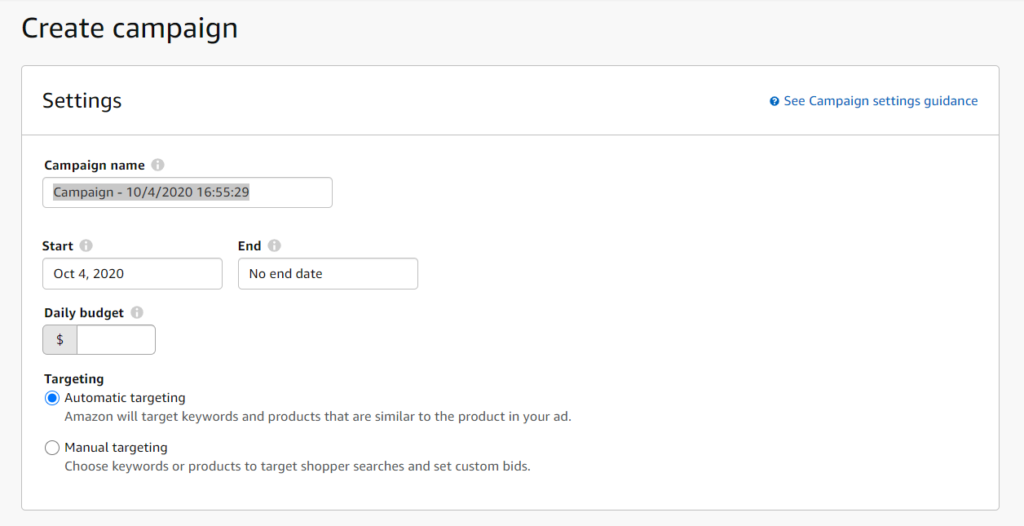
The campaign name will only be seen by you, so make it a name that you can identify.  I chose to name mine "Groomed - Sponsored Product - First Week" so that I will remember this is my first one.  I also chose automatic targeting so that I can see what Amazon and it's huge database of keywords will throw up for me.  This was recommended by NomadMillionaire on YouTube who is a pro at PPC, so I am following his lead.

You will need to determine how much you are willing to pay for this campaign.  I chose $15 dollars a day to start.  This will give me a chance to see what kind of action $100 a week can bring.

amazon-ppc-bidding-stragegy


CAMPAIGN-BUILDING STRATEGY

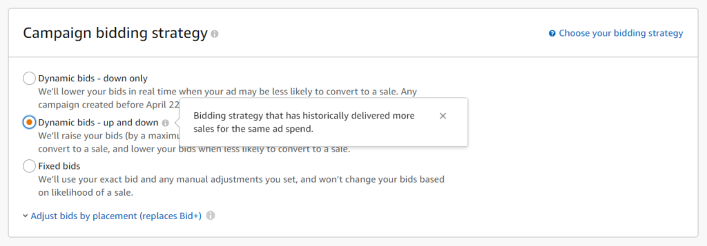
Since the second choice, Dynamic bids, up and down delivers more sales, I chose to go with this one.  This one week will give me an idea of how far up and down Amazon feels comfortable to go.  The other two choices can be manipulated by PPC pros, which I'm not right now!

Choose an Amazon PPC Format:

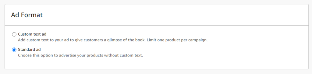
amazon-ppc-ad-format

I decided to go with the standard ad because I haven't researched custom text ads, so I will see what Amazon does using just a standard ad.

Name an Ad Group and Choose a Book/Product:

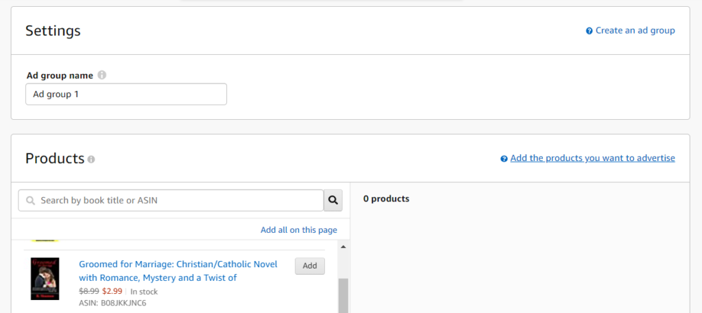
amazon-ppc-ad-group-and-products

In NomadMilliionaries's video that I referenced in our last blog post, he left the Ad Group Name to the default of Ad Group 1, so I did the same.  I didn't come across any tips regarding this in the other videos I watched, so I'm just going to see what it looks like after I have a few ads going and see if naming this in some other way will work better in the future.

You will be logged into your KDP account, so it will throw up all of your own products for you to choose, which I am doing with my new book Groomed for Marriage by R. Shannon but you can also choose a product by an ASIN number.  Most people who have found their way to this blog post will be fellow book marketers, so I won't go into ASIN numbers.

Automatic Targeting & Negative Keyword Targeting

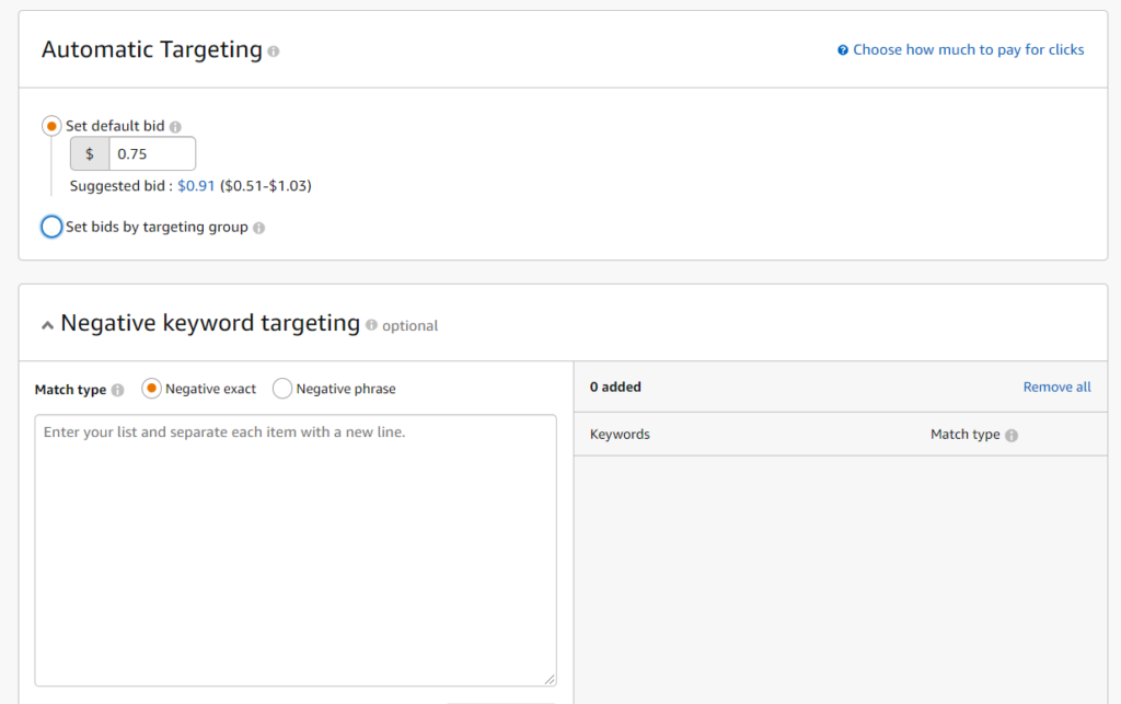
amazon-ppc-auto-targeting-negative-words

A default bid comes up with this box too and although I think .75 is too high for one bid, I am accepting it as I am also testing Amazon's algorithms to see what comes out.  This will only be for a week, so I have control over the overall spending.

I will want to find out how to use negative keywords in order to prevent my book from coming up with people who are searching for the actual crime known as grooming but this first week will give me an idea if that will even be a problem or if Amazon's artificial intelligence can already recognize fiction from non-fiction searches which it probably can.


Negative Product Targeting:

amazon-ppc-negative-product-targeting

This is the last box that comes up and I am going to let Amazon run the first campaign.  During this upcoming week that I am waiting, I will research negative keywords and negative product strategies so that when I am doing an exact campaign, I can use these strategies if they are worth it.

Once you click Launch Campaign at the end, that's it.  You're advertising on Amazon.  I hope this helps save everyone a lot of research time!


Should You Advertise Your New Book on Amazon

What I Learned in my First Week of Publication:

sherlock-holmes-graphicOnce I finished my first Novel, Groomed for Marriage, I launched it on BookFunell to give it away in order to build a reader list.  My expectations were low; I would have been happy to have given away 50 copies.  Well, to my astonishment, I wound up giving away over 600 copies of the book.  These are people who chose to sign up to down the full book for free.

So when I published Groomed for Marriage for $2.99, I thought it was so cheap that maybe I would have at least a few sales.  Crickets!

So my first lesson was:  BookFunnel is great for giveaways and building a list of readers, but FREE it's own animal.

Switching to Plan B:

So then my plan was to let the two weeks of my paid book promotion on BookFunnel run its course, which would have given me the cleanest feedback.  I would have known how many copies I was able to sell from BookFunnel at $2.99 with no PPC marketing at Amazon.  But even if I waited, let's say I sold 5, that wouldn't have been enough for me to stick with BookFunnel for a paid book as I already learned about Free being it's own animal.

So I decided that as a new author, I wanted to explore Pay Per Click advertisements to see what was entailed.  I did the research and the purpose of these next few posts will be to share my findings and save you the research time.

Pay Per Click as an Investment:

I watched lots of videos on YouTube regarding Amazon ads.  Many people have been doing it for a long time and had great tips.  Although all of these experts stressed the importance of profit vs. return on investment, which of course is crucial in any business, I am choosing to see my first two months of advertising as an investment.


An Overview of your PPC Goals:

The best video I saw, geared for beginners, was the one below by Nomad Millionaire.  It is from 2018, but Nomad explains PPC from a bird's eye view  and this is important for beginnings to understand the strategy right from the beginning.

So you will need a credit card, your book information, a computer, and you will need to be logged into your kdp.amazon.com account.  You will be ready to launch your first broad campaign.

Crash Course in NomadMillionaire's video:

Pay Per Click is an advertising program offered by Amazon that allows users to bid for ad placements.  Amazon searches are all based on keywords and other secret algorithms.  By choosing to start with a broad campaign, you get to ferret out all of the keywords that Amazon already knows about your product.

Once you have 7 days of running this broad campaign, you can begin to look at the broad campaign and figure out what keywords and initiating click throughs and which ones are leading to actual purchases.  Those keywords you then will add to a manual campaign. 

Nomad goes a little bit into his 'pricing strategies' that you may want to listen to, but it will all come down to how much you are willing to spend.

Next post we'll pick up with actually starting my first broad campaign and see where it takes up in the 7 day watch period.


Scrivener – Setting Up the Project Settings-Options – 2

scrivener-new-project-emptyScrivener comes with certain default settings.  Most of them are fine, as is, but you may want to change the font of certain items and things to make working in the project more comfortable.

For example, I prefer Times New Roman size 16 or 18 px.  I find when writing, this causes much less eye strain.  When the project gets closer to finished, I can go back and change the “compile” settings to Times New Roman 12px for actual upload to KDP.Amazon.com or for upload to a paperback template.

SETTING UP THE PROJECT SETTINGS/OPTIONS:

scrivener-meta-data-project-properties-db

The graphic above is where you need to be in order to change the Project Properties.  How to get there?  Click on Document => Meta-Data Settings => Project Properties Tab.  This will bring up the screen above.

Project Title will be one you fill in as well as Project Abbreviated Title.  For example:  The first book in my series is called Groomed for Marriage.  So I would fill in Groomed for Marriage in the top box and then for abbreviated, I would fill in Groomed.  You can also fill in your full author name, and then the last two boxes are to put in the first and last names separately.  This information is where the project will pull the Book Name and Author Name from.

I ignore the labels section and I don’t work with draft vs. final copy, I just work in a draft until I’m ready to compile.  So if you are a newbie, just leave those settings as is.

We will be addressing the Custom Meta-Data, but it will be more understandable later in the instructions.

scroll-black-scroll-on-trans

COMPILE OPTIONS AND SETUP:

scrivener-compile-first-screen

Click on File => Compile to get the dialog box pictured above.  This box allows you to make lots of changes.  I will start with a list of them and a brief discussion of what they change.

CONTENT:  This tells the Project what to include in your project and whether to follow other formatting instructions or upload/print as is.  So as a newbie, you won’t have much that shows up in this box until you start actually creating new files, so you can leave them as seen in the graphic above.  These settings will serve you well as a new scrivener user.

SEPARATORS:  This allows you to add a pound sign or you can add a few pound signs.  My advice for newbies is to remove this as it can get very tricky as you are working to have separators being automatically put in because you will be making many, many changes to your book and you don’t want to worry about having to remember to take these out or add them.  So until you get ready to upload to KDP.amazon.com or deliver to a publisher, do yourself a favor and forget the separators.

FORMATING:  This formatting can get very tricky.  I’ll try to explain this in the simplest terms.  This area tells Scrivener where it will be pulling it’s files from.  Just make sure “text” is selected in the second and third lines”.  You won’t need to know anything else for right now, but if you want a better explanation, the scrivener user in this video makes it very understandable:

TRANSFORMATIONS: – Ignore this
REPLACEMENTS: – Ignore this for now
FOOT NOTES/COMMENTS: – If you will be adding footnotes and/or comments, you will need to fill out these options.
PAGE SETTINGS:  These have to do with your headers and things, so you can work with the defaults, but this is also covered in the video below.

Next we will cover changing the “Tool Options”.