
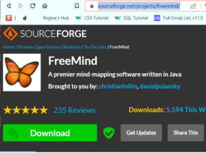
 This is the second step in writing a new fiction novel. In the first step, I start out with writing four potential storylines in FreeMind, which is a mind mapping software. You can see that video here.
Once I finish four potential plotlines, one of them usually pops out and wants to be written. I feel myself getting excited to write it. This process, although it's hard to think of four different storylines, gives me confidence right from the beginning that I am writing the best book for me right now. This whole process fills me with excitement to write.
OPEN SCRIVENER AND BEGIN:
I take my new plotline and open scrivener. I open one document and plan the crime itself. I'm presently writing a police procedural at this time, but even if you are writing a generic mystery, this technique will work. Most great fiction has some level of mystery or suspense in it, so it would even work for generic fiction.
I make a chronological list of the crime as it happens. When it happens, who it happens to, who the first witnesses will be, if any. I also isolate in my mind an actual scene of the crime. I put in all the evidence the cops or detectives will find at the scene. This will begin the investigation. In a mystery or crime novel, this is the inciting incident.
I also add to the list other suspects and what their motivation will be for the crime or mystery. As you begin to add different suspects into the mix, you will most likely have to change your original plotline idea to accommodate these new suspects.
I go through this whole process adding, subtracting and changing up the suspects and plotline in this abbreviated format. It should look like directions from Google maps or a long list of very short paragraphs.
A SECTION CALLED THE ENDING:
I have a section at the end called "How it will end". My books never end the way I indicate in this section. However, by having a solid idea of how I want it to end at this time, it gives me a direction and a destination. Then during the creative process, when I get new and better ideas, I simple go down my list and/or scene outlines (we'll cover these in another installment) and change up the outline. It's easy-peasy.
I do this for the entire storyline. At the end, you will have a good idea what the story is about, but there won't be any nuance, or personality in the story yet, so if it seems dry, don't worry about it. It is very dry at this point. You are knitting together a skeleton and bones are dry. You will breathe live into this as you get to the point of actual writing.
THE BENEFITS OF WRITING THIS OUTLINE:
 Most new writers want to start writing scenes and dialogue. They want to just get on with it. But the dark side of working this way is that when you find out your clues won't work when you need to add a new suspect, you will have written two chapters already. My process will save you from writing for the trashcan.
By going through this short one-liner outline in chronological order, anything in the story that won't work, it comes out in this layer of writing. This saves you from throwing away already written work.
There is a video I made for YouTube below. I go over some of these points but others tips and tricks as well. For your convenience, I have time stamps below in case you want to just jump to the section you want to look at:
01:27 - Open Scrivener and open one document
01:45 - Other suspects, their motivation, red herring, etc.
02:15 - How it will End section
03:20 - Determining the framework of the script which will prevent writing for the trash can.
05:30 - Review of the layer elements
05:43 - Sneak peek into the next videos
Writing a Novel in Layers:
First - A Little About the Chronology of a Crime
Writing a Novel - Layer 1
Writing a Novel - Layer 2
Writing a Novel - Layer 3
Writing a Novel - Layer 4
Writing a Novel - Layer 5
Writing a Novel - Layer 6
Writing a Novel - Layer 7
Writing a Novel - Layer 8
Writing a Novel in Layers

Have a peek behind a real novel.
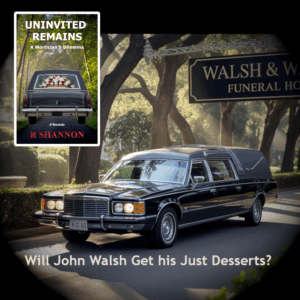
John Walsh is a successful funeral director with a loving family but he has a weakness for other women. The modern world thinks cheating is a victimless crime, but is it?
Movie Reviews
 The graphic to the left is a closeup of the tools panel. Each tool is represented by an icon. Below the tools is a graphic representation of your foreground color (the color on top) and the background color (the color in the back).
 As a self-published author, all marketing for my books falls to me. I can outsource it, but that costs money too. I have figured out, after publishing 11 novels, where my money is best spent. The answer is on line-editing, which costs between $400 to $500 or more depending upon how long your book is.
 Two of the most popular websites to give away or sell your book is through bookfunnel.com and siteoriginapp.com. These two companies offer the opportunity to join other authors in featuring your book. Everyone has a 'share date' and they share the promotion with their newsletter list and also with their social media following. It's a win/win for everyone.
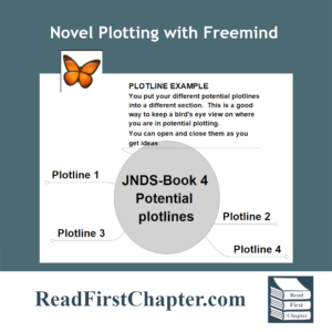 In the first installment of the Peek Behind the Novel Series, I wrote about working four different plotlines before choosing one. By working on four of them, it helps me 'improve' on some storylines and when I have four to choose from, I am able to go into the project knowing that I have chosen the best one. It's a technique that I use to build my author confidence.
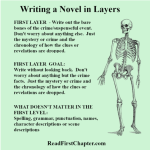 In the first layer of writing, I focus only on the crime or mystery. I make a list of the chronology of the crime. How it happens, who it happens to, how the detectives are assigned to the case. I focus only on the crime. I don't think of subplots, or dialogue or even the outcome. Only on the crime itself, almost like a Forensic Files show.
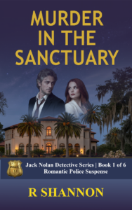


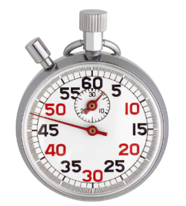 In writing mystery romances and police procedurals, it's important to keep track of time for a few reasons. One reason is that it's too easy to get lost in the writing and forget the time line. It may be morning in one scene and in the next scene you're referring to something happening at 4PM. Problems like these are very tedious to clean up after you're done writing. It's easier easier to track the timing while you create the scene, while you write.
 I mentioned writing in layers above. This is a secondary technique that I will blog about as I move along in my present book. I'll also give you a sneak peek behind the novel to see what levels I write in.
 Each new book requires a new plotline. I used to come up with a plotline and go with it. But I noticed I had a lot of insecurities as to whether it was good enough or whether I was choosing a plotline too soon.
 So I could tell the four plotlines was a working strategy going forward. The first time I did this, I opened a new Notepad document, plotted a crime and a potential storyline. When I finished, I named it the first potential plotline and filed it. Rinse and repeat. Sounds pretty straight forward, right?
 Since I began writing full time, I've noticed a difference between the type of energy writing fiction takes. Because I'm using creative energy, there's risk involved. It requires me to make decisions and choose to go down one avenue of story and not another. There's always a possibility that I may wind up in a dead-end or wish I had chosen another route. No one likes disappointment, especially the type where you look back and see hours and hours of wasted writing time!

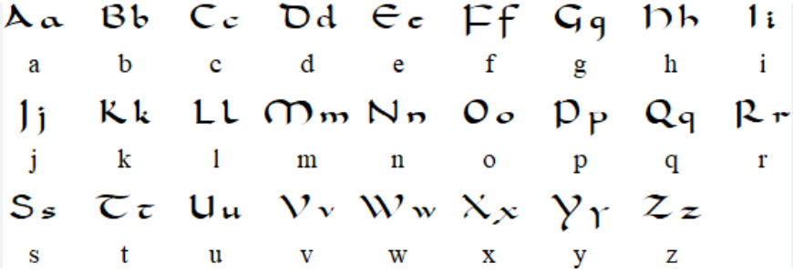 Carolingian minuscule or Caroline minuscule is a script which developed as a calligraphic standard in the medieval European period so that the Latin alphabet of Jerome's Vulgate Bible could be easily recognized by the literate class from one region to another. It is thought to have originated before AD 778 at the scriptorium of the Benedictine monks of Corbie Abbey, about 150 km (93 mi) north of Paris, and then developed by Alcuin of York for wide use in the Carolingian Renaissance
 The Carolingian Renaissance also saw a flowering of art and architecture. New churches and palaces were built, and illuminated manuscripts were produced. Carolingian art was characterized by its use of geometric shapes, bright colors, and intricate designs.