
FIRST THINGS FIRST:
 First there's the mystery outline of a novel. It's important to know where the mystery begins, the names of all suspects, everyone's motivation for murder or kidnapping, theft, etc. But once you have your crime and mystery outline, what then?
Then it's time to turn to the subplots. Below are the five best tips to come up with subplots that fit the story.
Make sure your subplots support the main plot.
 The subplots should not detract from the main plot, but should instead enhance it. They should add depth and complexity to the story, and they should help to drive the main plot forward. In a mystery, it's easy to mirror a main character's personality trait in a witness and create some inner dialogue. This ties it in nicely.

Give your subplots a narrative arc.
Each main character should have their own arc, even if it's a short arc for this one book in a series. There should be an arc of growth for the main characters. But just like the main plot, your subplots should have a beginning, middle, and end. They should have a clear goal or objective, and they should build to a satisfying resolution.
Write character-driven subplots.
The best subplots are those that are driven by the characters and the drama from their personal lives. The characters should have their own goals and motivations, and they should be actively working to achieve those goals throughout all four segments of the story. Even in a series, there should be a distinct growth on some level from the beginning of the novel to the end.
Try a new POV.
 If you're writing a first-person novel, try using a different POV for your subplots. This can help to add variety to your story and to give readers a different perspective on the events. This is not a technique that I would suggest to beginner novelists, but for authors who are more seasoned, yes, this is a way to shake things up a bit.
Figure out how to connect the subplot and the main plot.
The subplots should be connected to the main plot in some way. This could be through a character, or a job, a family connection or a neighborhood. The connection should be clear to the reader, and it should help to make the story more cohesive, more realistic.
Ramp up the tension with a subplot.
 Subplots can be used to ramp up the tension in your story. It's a great way to add a little more pressure onto your main character or characters! Not only do they have to catch the bad guy, but their landlord is threatening them, or their wife is threatening to leave them, etc. If the main mystery plot is getting a little slow as you drip in clues, you can spice up the subplot that will add some excitement and suspense.
Use subplots to explore themes.
Subplots can be used to explore themes in your story. For example, if your main character has a goal of having her own family, you could have a subplot about how the character is struggling to find their place in their family or with their in-laws.
Keep your subplots short and sweet.
 Subplots need to be interesting, yes, but it's easy to go overboard with them too. So the arc needs to be short but concise. They should be short and sweet, so to speak. They should be short enough to keep the reader's interest, but not so short that they feel underdeveloped.
Don't be afraid to kill off characters in subplots.
And the last tip, and this is mostly to beginners, don't be afraid to kill off characters in subplots. This can add a sense of realism to your story, and it can also help to raise the stakes for the main characters. It can also be a shocking event that heightens the tension or adds a twist in the plot.
CHECK OUT MY PEEK BEHIND THE NOVEL VIDEO SERIES
 I'm assuming all writers have doubts as they are writing the first draft. I know I do. Something happens between the feeling of knowing I have a good plotline and writing out the first draft.
 So the antidote to self-doubt is to keep writing. Trust your plotline. Know too that you can always add clues, rearrange some scenes, add a bit more intrigue into your subplots. Eight layers of writing leaves a lot of room for beefing up a story, deepening a story and polishing a story.
 For anyone who is new here, I use a Four Act Structure as opposed to the more-popular three-act structure. I find that middle section in the three-act structure too confusing. Over the writing of 12 novels, I gravitated to a four-part structure as it is more symmetrical and makes more sense to me. I also believe, for whatever it's worth to anyone, that this three-act structure is responsible for the 'lagging' that often occurs in the middle of a story.

 The end of Part Two usually marks the midpoint of the book. I like to end this section with a .big reveal of some kind. Or maybe a clue that turns the investigation into another direction. There could even be a new murder, or the surfacing of an unusual suspect, or someone gets caught in a big lie that changes the direction of the investigation.
 Now the investigation gets a little stressful. The detectives may not agree on who the guilty party is, or maybe they know who it is but can't find the legal evidence to prove it. Maybe they are operating only on gut feeling and speculation at this point. They are rushing against the clock or against other forces working against them to solve it, catch the guilty party or find compelling and irrefutable evidence.
 Part four is broken down into two parts. In the first half of Section 4, the crime or mystery is solved. There will be whatever drama you want to add about the solving of this crime. Whether your detectives are battling physically with someone, bullets are being fired back and forth, or entrapping the guilty party, or just uncovering that last piece of evidence that will legally prove guilt, this is where this is revealed.
 The second half of Part 4 is the 'wrap up'. This is where you will show the new normal, everyone's life 'in resolution'. This is where you will also explain the full growth of your characters. Many author's don't do this, but I don't like to read books where things end where the reader is left to decide what it all means. I may have my own opinions, but I like to know what the author meant by the story. So I make sure I explain, again very quickly, how things are ending in a narrator voice.

 Most new writers want to get to the writing already. But in this layer of writing, all plot holes or inconsistencies will show up. Any clues that won't work when adding more suspects and motivations will show up in this layer.
 My template is short but it keeps me on track. I'll break it down below. This small template I use keeps my writing on point and tight. It prevents me from meandering, dawdling, going off on an irrelevant tangent or writing myself into a corner.
 n order to prevent head-hopping, which is very common among new writers, you need to be constantly reminded that each scene is in one perspective. Some writers write in first person and that's easy.
 I don't know whether I am an author who is obsessed with time, or whether I use time as an element to put pressure to solve on my characters, but I have always tracked time. I find this helps me balance the story and make the story more realistic.
 Location is important for two reasons. One reason is casts the scene in cement. You have chosen a stage for the scene to take place. I don't write any scene or location descriptions in this layer of writing. But I can write the action of the scene in context of a location.

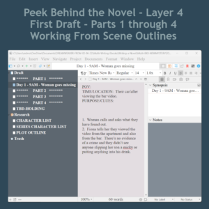


 Write forward only. Don't look back.
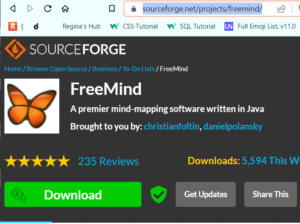 This is the second step in writing a new fiction novel. In the first step, I start out with writing four potential storylines in FreeMind, which is a mind mapping software.
  Most new writers want to start writing scenes and dialogue. They want to just get on with it. But the dark side of working this way is that when you find out your clues won't work when you need to add a new suspect, you will have written two chapters already. My process will save you from writing for the trashcan.


 Gimp is a free graphics program and it's fairly easy to use. But a lot of the program is not self-explanatory. So you can get lost really easily. A graphics designer needs to know how the entire program works. For authors, writers and other self-publishers, you only need to know a few of the tools to do pretty much everything you need to do.
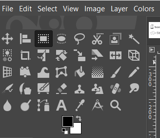 The graphic to the left is a closeup of the tools panel. Each tool is represented by an icon. Below the tools is a graphic representation of your foreground color (the color on top) and the background color (the color in the back).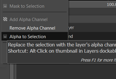
 However, if you just open the document and try to add something that needs a transparency, it will cause a lot of frustration because the transparency won't work. If you do this, open with a white or black background, then go over to the layers panel, right click on the layer and select "add alpha channel". When you do this, nothing will happen, no noise is heard. It feels like nothing happened. But it did.
 As a self-published author, all marketing for my books falls to me. I can outsource it, but that costs money too. I have figured out, after publishing 11 novels, where my money is best spent. The answer is on line-editing, which costs between $400 to $500 or more depending upon how long your book is.
 Two of the most popular websites to give away or sell your book is through bookfunnel.com and siteoriginapp.com. These two companies offer the opportunity to join other authors in featuring your book. Everyone has a 'share date' and they share the promotion with their newsletter list and also with their social media following. It's a win/win for everyone.
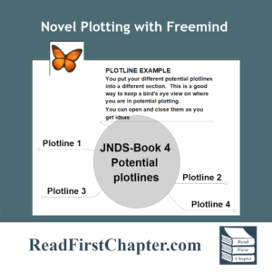 In the first installment of the Peek Behind the Novel Series, I wrote about working four different plotlines before choosing one. By working on four of them, it helps me 'improve' on some storylines and when I have four to choose from, I am able to go into the project knowing that I have chosen the best one. It's a technique that I use to build my author confidence.
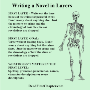 In the first layer of writing, I focus only on the crime or mystery. I make a list of the chronology of the crime. How it happens, who it happens to, how the detectives are assigned to the case. I focus only on the crime. I don't think of subplots, or dialogue or even the outcome. Only on the crime itself, almost like a Forensic Files show.




 I mentioned writing in layers above. This is a secondary technique that I will blog about as I move along in my present book. I'll also give you a sneak peek behind the novel to see what levels I write in.